Category : Spectrum Noir

42 posts

This past weekend a few of my fellow stampers and I attended Heirloom’s Lawrenceville Rubber Stamp & Paper Arts Festival. It began with the Design & Treasure Make-n-Take Friday night. We made four cards, visited with a favorite vendor “Pink & Main”, used new products, experienced new techniques, and had a great time. When we were leaving, I noticed a notebook on display with ATC (Artist Trading Card) on display and announcing the ATC contest. I remembered reading about it and wanting to create an entry when I registered, but I had forgotten about it. I decided to make a couple of ATCs which were to reflect the theme of Freedom and enter them the next day.

Saturday morning came bright and early. I had set my alarm the night before, but it didn’t go off; so, I was in a little bit of a rush before my friend, Cheyenne, got here with some stamp sets that were Freedom themed. We were to  head toward the weekend’s shopping event where we were to meet some other friends at the event by 10:00 a.m. Just a note to the alarm issue, I did set it, but for the weekday. LOL

I began the creation process half awake and a head full of cotton, but that could have been a plus since I couldn’t overthink the process. Really, I could barely think. I took the 3 1/2 x 2 1/2 pieces of cardstock and pulled out my Fun Stampers Journey Sweet Berry Splash, Blue Lagoon Splash, Cranberry Bliss silk, Sparkle Dust, Black Licorice Twine, Journey Medium paste along the FSJ spatula applicator along with some post-it note tape. I pulled out my SU! stripes and stars stencils; thus began the card base process.

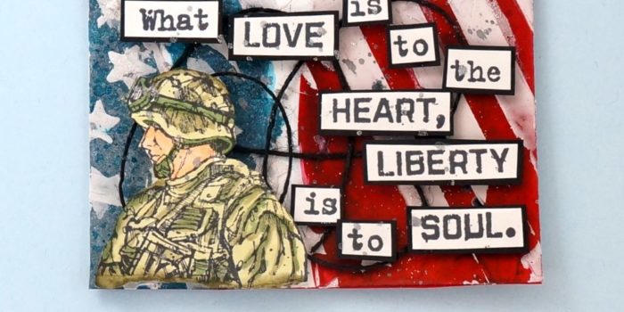
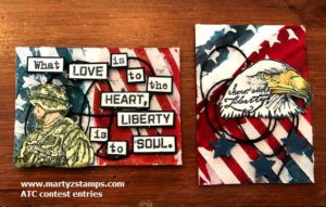
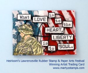
In a container, I spritzed some Sweet Berry with a mist of water. I used a paint brush and applied a swipe of Sweet Berry across the cards. It wasn’t brillant enough; so, I thought why don’t I add some Cranberry Bliss silk and that did the trick. I reapplied the mixture to the card and it looked gorgeous. Then, I took the Blue Lagoon Splash and did the same process.  I did try to add some Dark Roast to create a more navy blue color and it was a little too much which created a blackish blue. All I did was add more Blue Lagoon splash and pulled a small, small dot of the blackish blue color into it, mixed it a little, and Bob’s your uncle; it looked great. On the soldier ATC I added full blue color, but on the eagle ATC, I masked off some stripes and added the color to this area to provide a little interest.

Next, I applied the medium paste using the stencils to the card base and sprinkled Sparkle Dust onto the wet medium to create some sparkle and glitz. The final embellishment was several loops of Black Twine. I sat the emerging ATC pieces to the side to work on the stamped images.

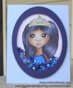
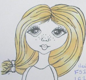
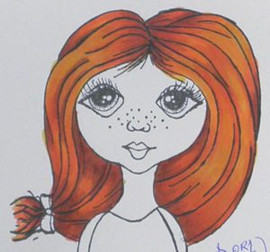
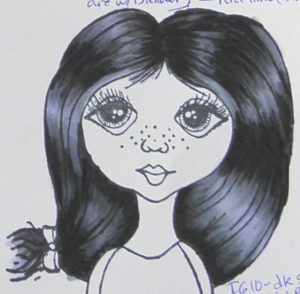
By this time, Cheyenne arrived with the SU! stamps. I didn’t have any stamps that reflected the Freedom theme, but she had two SU! retired stamp sets (they are very, very retired). They were perfect. I took the soldier stamp and coordinating words from one stamp set and stamped them onto FSJ Whip Cream cardstock using Memento ink. I colored the soldier using Spectrum Noir markers. Each of the words I cut out individually and matted on FSJ Black Licorice cardstock. I took a very light gray Spectrum Noir marker and went over the words to tone down the brightness of the Whip Cream cardstock. I popped the soldier and words out using FSJ Foam squares; and, as a final touch, I sprinkled a little Silver silk onto the ATC. Here is Cheyenne’s iPhone pictures. She liked them better with a woodgrain background:

The cards were judged by the vendors at the show. Here is the winning ATC card:

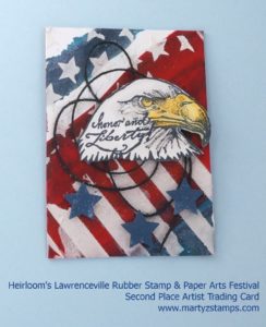
I created the eagle card by stamping the eagle onto FSJ Whip Cream cardstock using FSJ Black Licorice ink. Cheyenne suggested stamping the coordinating words directly onto the eagle. I thought that was a GREAT idea, and as you can see, it looks gorgeous. I colored the eagle with Spectrum Noir markers. The eagle is popped up using FSJ Foam squares. I punched out three small stars from FSJ Denim Days cardstock. Even though they didn’t have a first, second, and third place winner, the eagle ATC card was the second most chosen card by the vendors.

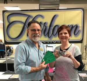
I think they both turned out beautifully. I won $25 show bucks which meant I could go and purchase products from any of the vendors. Here I am receiving the Show Bucks:

I went back to Creek Bank Creations and purchased two more 3D embossing folders from We R Memory Keepers Next Leveling Embossing folders. These are awesome; they create a 3D embossed look to your cardstock, which adds wonderful dimension and interest to your card. I have three posts coming up featuring these folders. The rest of my winnings I spent at Pink and Main. I purchased a cute, cute frog stamp set (it’s one of the upcoming card creation posts) and a pirate set just for my little buddies to create some cute cards.

Thanks Cheyenne for your stamp sets and your critiques during the creating process.

This week’s Paper Craft Crew Challenge #226 is a Birthday theme card. Here is their card sketch:

A week and a half ago, I went over to my friend’s house to help her set up her new Brother Scan-n-Cut. Once we had it working to scan and cut out stamped images, we made a card using the Lawn Fawn fairies we had just cut out. We colored the fairies using Spectrum Noir Alcohol Markers. The designer paper is from a paper stack (I think it is Penny Black – not sure). The “happy BIRTHDAY” is cut from a My Favorite Thing die set out of Fun Stampers Journey cardstock (this was cut out at a later date at my house). The grassy hill and flowers are cut from the Lawn Fawn coordinating dies that work with the Fairy set and the hill is embossed using a SU! embossing folder. The cardstock mat is SU! cardstock as well as the grassy hill and flowers.

As we were working on our cards, I became extremely nauseated and left to go home (not realizing I had left my unfinished card project). My friend, Cheyenne, brought it over and gave it to me to finish, but she didn’t realize I had not stamped the sentiment on my card; so, we had cut out the “happy BIRTHDAY” for a card Cheyenne was making for a friend and it just didn’t fit what she was creating and it was pushed aside. A few days later, I was going through my cards that needed to be completed or updated to sell on my Etsy shop and I thought this “happy BIRTHDAY” would work wonderfully on my card. Voila! It did and here it is:

What a cute, adorable card to give someone special on their special day!

This past weekend a very dear friend’s daughter, Paulina, celebrated her Quinceanera. I wanted to make her a very special card for her birthday using Spectrum Noir alcohol markers, because I, my daughter and son, and my friend, Cheyenne, bought her 84 Spectrum Noir markers. Woo Hoo! I know she will make some incredible art projects using her markers.

I thought the Fun Stampers Journey Media Artist girl was the perfect stamp to create a card for Paulina. I stamped the image on SU! Whisper White cardstock using Memento Tuxedo Black ink. This is the best cardstock I’ve found for coloring with alcohol markers. It took me about two hours to complete the coloring. To get a smooth finish, you have to take your time and work coloring small areas at a time. I tried to video tape the process, but the battery gave out before I was finished.

Lest any of you think I just throw together cards with no mess ups or problems. I had to pull this card apart about five times before I was satisfied with how the card looked. I decided about the fourth go round to make a shaker card, and I think this was a great choice. Here is the first picture before I stamped the flowers onto the card.


After I took this picture, I decided to stamp the flowers that is part of the FSJ Media Artist girl stamp set onto the card using SU! Midnight Muse. Here is the final card.

I absolutely love this card and I hope you do too!

Supplies:

Fun Stampers Journey:
Stamp Set: FSJ Media Artist girl

Stampin’ Up!:
Cardstock: Whisper White, Bashful Blue, Night of Navy
Ink: Midnight Muse

Spectrum Noir Alcohol Markers, Spectrum Noir Clear Glitter Pen

Miscellaneous:
Sequins, Acetate, Stitched Oval Dies from Lawn Fawn

Well, Cheyenne and I got together on Wednesday and made the most adorable card EVER! She had purchased Tim Holtz’s Dog stamp set with coordinating dies. She came over to my house whipped those stamps and dies out of her little black bag, and we got off to a ruff start (ha, ha – do you like the pun). Anyway, she wanted to create a dog with textured hair. She had a picture to go by from a Pinterest pin, and I tried to pick out Spectrum Noir colors that were a close match. We got half of our dog’s faces done and she didn’t like them. They weren’t the correct color. So, upon her insistence, we started with a fresh dog stamped in SU! Smokey Slate. The first one was stamped with Memento Tuxedo Black, but we wanted the hair to over-balance the stamped image’s outline. That’s when I said, let’s make our card using the Paper Craft Crew Challenge #217 (why not kill two birds with one stone). So, she pulled the sketch up on her phone and we began again.


We took our stamped image and gave it a base color of Spectrum Noir EB1 and LV1. Then, we took my Fun Stamper Journey Color Burst pencils and began to create shading (darkest brown) along with several other colors to create lighter shading and depth to the dog. Once all of this was accomplished, we kept our pencils sharpened and began making flicks of color onto the dog image. This took a LONG time. It takes a very light touch, and when you flick the pencil lead, you need to lift at the same time so your hair image looks light and hairy. We used several different colors with the black pencil giving more depth and a white gel pen was used to add light effects on the hair. Cheyenne said my dog looked mad and her dog looked scared.

Once we were happy with our hair and color of our dog, we cut out a nose and popped it out and added Journey glaze to give it a nice shine. A bone and ball were added to my card. Cheyenne added a leash to her card, but I couldn’t add one to mine because my matted dog was in a different place on my card than her card. I took the Fun Stampers Journey ATS stamp and stamped the sentiment onto FSJ Oatmeal Cookie cardstock. I made faux washi tape out of cardstock and placed a Journey twine bow up at the top of the card (I did have my twine on the smaller mat as in the sketch, but it pulled your eye away from the focal point – the dog). Last but not least, the dog, the mat the dog is on, the bone, tennis ball, sentiment, and the smaller piece of washi tape are popped out. I used fun foam for everything but the washi tape. All of the printed paper is from The Pets Stack paper stack which was purchased from Hobby Lobby a long, long time ago. The base of the card is FSJ Oatmeal Cookie cardstock. The mat for the dog was cut out using a rounded corner stitched rectangle die from Pink and Main. Here he is. He thinks you are “Looking Good.”


Hope you enjoy!

In one of my Spectrum Noir classes I taught to my colorists, we used our Spectrum Noir alcohol markers to color a stamped image from C. C. Designs Rubber Stamps & Dies called Scaredy Cat (DA1006). I just love the expression on this cat’s face with the sentiment, “Need a HUG?!” I can’t decide if the cat is super excited, totally scared of something and needs a hug, or what my face looks like when someone is coming in for a hug. LOL What do you think?

I know I think this made a great card to submit at Freshly Made Sketches card challenge #259 this week. The sketch is super simple but some really WOW cards can be made from this sketch. Here is the sketch:

My card featured “Scaredy Cat” colored with Spectrum Noir markers and popped up on a circle with two banners peeking out from below. For added interest I die cut a stitched rectangle and matted it on FSJ Deep Lilac cardstock. The cat was stamped using Memento Tuxedo Black Ink and the sentiment was stamped with FSJ Black Licorice. Love it!

Enjoy!

Supplies:

Fun Stampers Journey:
Cardstock – Whipped Cream, Deep Lilac, and Lavendar Fusion
Inks – Memento Tuxedo Black, and Black Licorice
Dies – Stitched Rectangles

This past September three friends and I went to the Stamp Scrap Art Tour held in Duluth, GA. Pink and Main was one of the vendors at this show. The owner and illustrator for Pink and Main, Michelle Currie, was at the Friday night make-n-take, and we were able to complete an awesome card, purchase a discounted die set (only available during the make-n-take), and have a great time enjoying her company. We also had the opportunity to see her the next day while shopping for all sorts of goodies. My friend and co-crafter, Cheyenne, purchased their scarecrow stamp set and coordinating dies.

We spent a whole afternoon stamping the scarecrows and coloring them with our Spectrum Noir alcohol markers. We had a great time. Cheyenne ended up putting her card together that evening, but when I am tired I know better than to try to pull together something important. It usually spells disaster. I finally put mine together this weekend. AND, it is gorgeous.

When I saw the Paper Craft Crew #215 challenge today, I knew my Pink and Main Scarecrow card was the perfect match for this challenge. Here is the card challenge:

For our scarecrow card, we stamped the images on Spectrum Noir paper with Tuxedo Black Memento Ink. The images were colored with our Spectrum Noir alcohol markers. See the end of this post for the color combos. Several of the images are raised using black foam. I believe we used Lawn Fawn’s 6×6 plaid paper pack for the printed mat. The blue mat is SU! Bashful Blue (a very retired cardstock), the plaid mat is on FSJ Hazelnut cardstock and the base is a SU! paper (Cheyenne’s paper wasn’t listed but I think FSJ Orange Rave or Tangerine Fusion would work really well). The mini-clothes pin and twine are from Fun Stampers Journey (FSJ). Here is the card:

Spectrum Noir Color Combos (the ones I wrote down):

Jeans – TB5, TB2, TB4, GG1
Corn – CT1, GB9, GB6
Straw – CT4, GB6
Hat – Fl Yellow, TN3, FS1 and Color Burst pencils for crosshatch texture
Pumpkins – CT1, OR2, OR3
Corn stalks – can’t remember the lighter green but I did palette blending with the lighter one and DG3

Supplies:

Pink and Main – Scarecrows and dies, stitched rectangular (rounded corner) dies
Lawn Fawn – plaid paper stack
FSJ – Tangerine Fusion, Hazelnut cardstocks, Color Burst Pencils, twine, clothes pin
Inks and Markers – Memento Black, Spectrum Noir alcohol markers
Misc – Black Fun Foam sheets, fence die (bought a long time ago from My Favorite Things)

If you have been keeping up with my posts, you will know I have been offering classes on how to color with alcohol markers; specifically, Spectrum Noir alcohol markers. We have learned the basics, moved on to skin coloring, and most recently, worked with hair coloring. This, so far, would be the most challenging technique to learn. After coloring about ten samples, I finally came up with a way that creates some gorgeous highlight effects on hair. If you go back and look at the Spectrum Noir – Skin Coloring post and look at the completed skin coloring class sample showing the range of skin tones we learned, you will see each girl’s hair is colored. The images looked so stark when we finished, I hurriedly added some color to their hair to even out the stamped images without taking the time to account for in-depth lighting and shading. Now, take the time to compare these previous images to the actual class images and you will see a huge difference in technique. The Spectrum Noir – Hair Coloring technique took two to three times the amount of time to create stunning highlight effects versus slapping on some color.

Before I show you the first sample, I want to detail the technique I used on all the stamped images. First, I consulted my Spectrum Noir hex chart and determined which colors I wanted to use for each sample used in the hair coloring class (light blonde, platinum, golden blonde, brunette, bright red, and black). Next, I lay out my color choices with the darkest color first, the lightest color next, the second lightest color beside the lightest color; then, a medium color (note: some choices only included three colors and sometimes certain hair tones might require more, but I think you get the jist). Contrary to how we started coloring in the basic and skin tone class, I start with the darkest shade first, adding the lightest highlight areas next making sure to leave white space (do not color all white space); then, moving from color choice to color choice as mentioned previously in how I set up the order of my markers. This order also helps to keep me from grabbing the wrong color and messing up my whole project by accident. I am working on making video tutorials for hair coloring.

Note: For both the skin and hair coloring classes, the student’s purchased Fun Stampers Journey – Media Artist stamp set. This is a larger stamp and great for learning how to manipulate the Spectrum Noir alcohol markers using shading and highlighting effects.

Sample #1:

Light Blonde –  Blonde hair is the easiest hair coloring effect. This is due to the makers having a high content of blending solution in them. The effects are more subtle and not so easy to create a hot mess):

Light Blond Hair


Sample #2:

Platinum Blonde – One of my friend’s has platinum blonde hair. This is a very hard color to recreate, because the shading can be minimal; but yet, you need shading to create depth and interest to your image. This hair color will be a project in the works requiring more experimentation until I get the color combination down to my liking.


Sample #3:

Golden Blonde – A very easy color combination with easy blending. But, yes there is a “but”, beginning with this darker shade and with all the darker shades, you do not want to pull or blend the darkest color(s) using your lightest color(s). You will want to make sure to blend out the darker colors with your medium tones into the lighter areas; then, use your lightest color(s). If you don’t, the high amount of blending solution in your light colors will act like a blender pen and pull color out of your dark shades. This will make your shading look mottled and blotched (not good).


Sample #4:

Brunette – Another easy hair color to create.


Bright Red – Yes, this is a very bright color, but I LOVE it (hmmm, I wonder why).


Sample #6:

Black Hair – By far the hardest hair color to create. It is important to create appropriate highlights when coloring black hair. This sample image has a lot of light hitting her hair. You will still need appropriate highlights even with minimal light; otherwise, the hair will look like a huge ink blob of black with no definition. Yuk! Several colors can be chosen for black highlights, grays, purples, and blue hues. If you will start to notice highlights on black hair in the real world, there are varying shades of light colors creating these highlight effects. Also, begin to notice where the light falls on on the hair with different hair styles. It took me three tries to come up with a black hair color, I liked. I did like the one before this one, but it had a lot of medium-light purple shading, which made her a great looking goth girl; but, for the class, I wanted to go lighter with the higlights. Also, this hair color takes three to four times as long to create. You HAVE to take your time, begin in small flicking strokes, blending and highlighting, moving on little by little to cover the entire hair area. If you go too fast, your darker areas will begin to look like black blotches. A special note here: I used the True Black almost at the very end of coloring the image. It is too easy to put too much black down and create a mess. It is used sparingly.


I will add more hair colors at a later time along with my coloring bloopers, and I will add some skin tones to my girls as well.

Supplies:

Fun Stampers Journey – Media Girl Stamp Set
Ink: Memento Tuxedo Black
Color: Spectrum Noir Alcohol Markers


At the end of last month, my cousin, Barbara Helms, celebrated her 40th birthday (her birthday is actually in September). I couldn’t make it to the celebration, but I sent her this card, which was a total CASE from K Werner Designs on YouTube. My friend and cohort, Cheyenne Luken, purchased Lawn Fawn’s So Smooth stamp set, and we went about making a shaker card. We both had to start over from scratch (note here: do not use alcohol markers to blacken the edge of cut cardstock – it bleeds).

Anyway, we completed the card and I thought it was the perfect card to send to my cousin. As many of you know, I don’t send cards, I hoard them. I am trying to get better about this. Here is the card we made and I sent to Barbara:

Supplies: Lawn Fawn So Smooth stamp set
Ink: Memento Ink
Markers: Spectrum Noir Alcohol Markers
Cardstock: SU! Whisper White, the mat is from a designer paper stack Cheyenne bought (don’t know the name), Acetate
Die: Lawn Fawn crosstitched rectangle die
Sequins: Pink sequins from Cre8tiveartz
Adhesive: Insulation Foam Tape

When I purchased my Spectrum Noir alcohol markers, I sent out an email letting my group of stampers know I would be providing classes on how to use these wonderful markers. The only requirement was they needed to purchase their own markers to use in class. I had four ladies sign up, and they went ahead and purchased all 168 markers through Consumer Crafts (they have the BEST price on these markers AND they offer 25% site wide regularly – just saying). We have had two classes so far, and I wanted to give a quick update about the progress of our Spectrum Noir alcohol marker colorist group has made as of this past week.

Note: These are NOT Copic markers and quite frankly, some of the YouTube reviews and compairsons do not do the Spectrum Noir Alcohol Markers justice. These markers fit into their own category; they are versatile; produce a great colored image; they are VERY affordable; and if you will watch the Spectrum Noir – Crafter’s Companion tutorials, you will have great success and produce outstanding papercraft projects. That being said, you can find Accreditation Coloring Download at www.spectrumnoir.com .  You can print this off on an inkjet printer and follow along with their YouTube tutorials to learn, to practice, and to turn in to them to receive accreditation as a colorist.

My first class was learning some of the basics. We covered Smooth Coloring, Basic Blending, Palette Blending, Dimension, Layers, and Florals. The class had a GREAT time and came away with a lot of hands-on practice (we colored two images).  Here are the two sheets we have completed so far (note: the second class was skin coloring; therefore, the skin on the girl is colored in on the second sheet):

I found it very hard to get a good picture. The heart on the first sheet is a deep purple color and in “real” life, you can see this clearly.


The second class focused on skin tones. I researched Spectrum Noir recipes for skin color on Pinterest and I took those color combinations and either used them, tweaked them, or came up with my own. The cost for classes two and three (skin and hair coloring) included a Fun Stampers Journey stamp called Media Artist (see below).

This image of the girl is a fantastic stamp to practice color combinations for skin and hair. I stamped six images of the girl onto Fun Stamper Journey Whipped Cream cardstock. Note: The quality of paper is important when using any alcohol markers. A lower quality product will increase bleeding of your ink color into areas you don’t want to be colored. Stampin’ Up! Whisper White is a great cardstock to use as well. You can also purchase specialty paper through Consumer Crafts for alcohol marker coloring.

We completed our skin tones, and we all made a few mistakes (that includes me). On my #6 girl, I used the wrong base color (I switched my colors) and she was so dark that her nose couldn’t be seen. I was able to correct this with the blender pen chisel tip and going over and over the image until I pushed some color through the cardstock to lighten up the image. You can tell because the coloring is a little mottled. I found that some of the lighter colors in the combo I chose could pull color out (acting like the blender) instead of creating a smooth blend. You will be able to see this in the next picture. But, that’s o.k. because we are all new to this type of coloring and there is always a learning curve when you learn something new.  I will be gong back and stamping more images and honing my skin coloring techniques to share with my group of colorists. Our next class will feature hair coloring. The image below has the hair colored because I decided to play around after class to see what I could come up with. These are not perfect hair colors, but I just felt the girl’s looked a little naked without hair color. Here is the sheet from class:

Once these classes are finished, our group should be able to scan and upload our accreditation pages to Spectrum Noir and receive their stamp of approval. I will, then, develop YouTube tutorials on how to color with the Spectrum Noir alcohol markers. I hope you decide to look into Spectrum Noir alcohol markers and begin to create outstanding colored papercraft projects.

If you have been reading my blog posts recently, it is very apparent I’m hooked on the Spectrum Noir alcohol markers. I just LOVE them and the awesome results I get from using them on my card projects. This week’s Paper Craft Crew Card Sketch #207 inspired me to make a card out of C.C. Designs – Chameleon (You Color My World!) rubber stamp. I purchased this stamp through Impressive Ideas stamp store in Norcross, GA. Here is this week’s sketch:

He is trying to camouflage himself amongst the bright yellow, orange, pink background of the card mat. He’s just too darn cute. The base of the card is SU! Tangelo Twist card stock. The bottom mat was created from a piece of SU! Whisper White cardstock using SU! Daffodil Delight and SU! Tangelo Twist a sponge dauber and SU! Happy Patterns Decorative Masks. The top mat was created using SU! Whisper White cardstock and distressing the cardstock with Tim Holtz Picked Raspberry and Spiced Marmalade inks. I squirted the paper with some water and blotted it dry and then allowed the mat to sit and dry completely before adhering all the elements. The square scalloped frame in the left hand, bottom corner is from SU! Layering Squares Framelits using Glitter Cardstock Matstack purchased from Hobby Lobby. I gave the card a little sparkle and glitz by gluing some Craft Medley sequins to the card. The gold twine, wooden heart, and washi tape are all from Stampin’ Up!. Note: The wooden heart was colored using the Spectrum Noir marker BP4 and then covered with Crystal Effects.

The chameleon was stamped with Memento Tuxedo Ink and colored using Spectrum Noir Markers. Here is the list of markers I used: LV1, CT4, OR1, OR3, CR10, CG3, GB7, TN7, CR6, CR7, CR11. I added SU! dimensionals under him to add depth and dimension to the card. I just love him. He’s sending everyone hugs and kisses!

PCCCS207

I hope you enjoy this chameleon as much as I do.

PAGE TOP
[dealsbar preview] Amazing Deals: !!toolbar-deal-title!! - !!toolbar-deal-merchant!!