Category : Fun Stampers Journey

111 posts

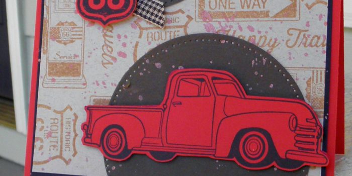
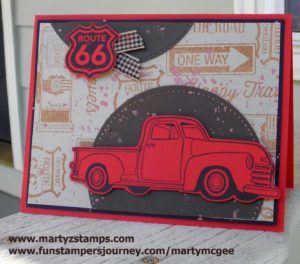
Next weekend, I along with three other friends will be at the Fun Stampers Journey – The Amazing Tour. We are super excited to go and experience all the “Amazing” energy and creativity. I have been to many papercrafting events throughout my 13 years of papercrafting, usually, involves taking cards I have made and trading them with other event participants. We call them swaps. The swaps should be exclusive to the company presenting the event. So, for this trip, my friend – Debbie Kissel – came over and we re-made some swaps we used for a Coach meeting.

I wanted to feature an Artist Trading Stamp (ATS) keeping the price point low for papercrafting beginners and those on a limited budget.  Although the card featured in this post looks labor intensive, it is a super simple and quick card to make. This card definitely has a WOW factor. Hello – you can create awesome cards without breaking the bank. 

OLYMPUS DIGITAL CAMERA


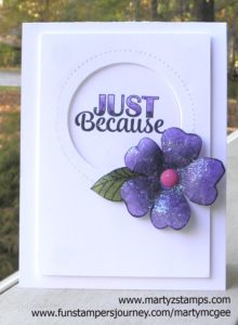
Here is how I made these cards:

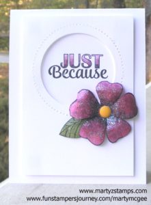
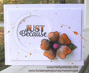
  1. I used Fun Stampers Journey (FSJ) Black Licorice ink to stamp the flower and leaf images. I stamped directly on Watermelon Fusion and Lavender Fusion cardstocks. I stamped the leaf on colored cardstock as well (Sweet Pear or Limeade Splash both would make a wonderful leaf).
  2. I used the Candy Apple ink pad for the Watermelon Fusion flower and the Lavender Fusion ink pad for the Lavender Fusion flower. Using sponge daubers (one for each color) and starting in the middle of the flower, I applied the ink in a circular motion and stopped about 1/4″ from the tip of the flower petals. Do this until you are satisfied with the shading.
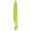
  3. I fussy cut the flowers and the leaf (a die is available, but the flower and leaf need to be cut next to the stamped image for the best effect). 
  4. I placed the flowers on a foam mat that is firm but not too firm (you want it to have a little give). I took the large stylus on the Journey Bloom Tool; starting in the center of each petal, I applied pressure and moved the stylus in a circular motion out to the edges of the petal and back toward the middle of the flower until the petal began to curl in on itself. I did this to each petal. Note: For this second round of flowers, Debbie was the stylus operator.
  5. I turned the flower over, cut the petals apart about 1/4″ from the center. I placed the flower on the mat; using the stylus, I pressed down hard and move in a circular motion in the center only. Note: The petals should pull in toward the middle. You can squeeze and shape the petals with your fingers. The leaves are done the same way but only working on the backside of them.
  6. I placed all the flowers that were created (10 in all) in a box and made a solution of 1/2 Journey glaze and 1/2 water (I saw Richard Garay do this on a video to make a sparkling background for a snowman card). This solution was created in a spray bottle I had in my craft room. I sprayed the flowers; then, sprinkled them with Journey Sparkle Dust (I used a small glitter shaker bottle). I should have sprayed the flowers again to set the glitter, but so far the glitter hasn’t come off.
  7. I cut a circle in the top mat ( top mat measurement 5″ x 3 1/2″) using the pierced circle dies. I placed the pierced circle die on the outside of the circle I wanted to create, and nested the cutting circle die inside the pierced die. I saved the cut circle and set it to the side.
  8. I popped out the mat with the medium Journey Foam Squares and adhered it to the Whipped Cream cardstock base.
  9. I used the circle that was left over from cutting out the mat to stamp the sentiment. I colored the sentiment with the Color Burst pencils in a color that coordinated with the flowers. I placed liquid glue on the back of the circle and pressed it into the circle and directly onto the cardstock base.
  10. I adhered the flower and petal with liquid glue and placed a Spring Accent Dot in the middle of the flower.

One of the mats had the circle cut off-center; so, instead of wasting the cardstock, I looked at it and thought . . . hmmmm. . . . I could make the same card in a horizontal position. I created an additional WOW factor using Orange Rave and Gold silk accents on this card. Note: I left the first two cards “clean”, because I didn’t have the silks I wanted to use with those flowers,. I think having two different ways to complete a card shows the versatility of our amazing products. Some of my stampers like “clean” and others do not – they want Wow, Wow, Wow.

Here is the mistake turned into a raving beauty:

Supplies:

All Fun Stampers Journey – all products can be purchased through my website.

Cardstock: Whipped Cream CS-0040, Lavender Fusion CS-0017, Watermelon Fusion CS-0039, Orange Creamsicle CS-0024
Ink: Black Licorice IP-0009, Lavender Fusion IP-0036, Candy Apple IP-0017, IP-0043
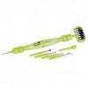
Die: Pierced Circle DI-0039    Use a Bloom Tool to separate the pierced die from the paper TO-0073
Adhesives: Journey Glaze AD-0003 or AD-0002, Journey Foam Squares AD-0085, Craft Glue AD-0111
Embellishments: Journey Sparkle Dust AC-0013, Spring Accent Dots AC-0179
Silks: Orange Rave IP-0118, Gold IP -0096
Suggested Silks for first two cards: Cosmic Grape IP-0117 and Outrageous Pink IP-0109

Well, Cheyenne and I got together on Wednesday and made the most adorable card EVER! She had purchased Tim Holtz’s Dog stamp set with coordinating dies. She came over to my house whipped those stamps and dies out of her little black bag, and we got off to a ruff start (ha, ha – do you like the pun). Anyway, she wanted to create a dog with textured hair. She had a picture to go by from a Pinterest pin, and I tried to pick out Spectrum Noir colors that were a close match. We got half of our dog’s faces done and she didn’t like them. They weren’t the correct color. So, upon her insistence, we started with a fresh dog stamped in SU! Smokey Slate. The first one was stamped with Memento Tuxedo Black, but we wanted the hair to over-balance the stamped image’s outline. That’s when I said, let’s make our card using the Paper Craft Crew Challenge #217 (why not kill two birds with one stone). So, she pulled the sketch up on her phone and we began again.


We took our stamped image and gave it a base color of Spectrum Noir EB1 and LV1. Then, we took my Fun Stamper Journey Color Burst pencils and began to create shading (darkest brown) along with several other colors to create lighter shading and depth to the dog. Once all of this was accomplished, we kept our pencils sharpened and began making flicks of color onto the dog image. This took a LONG time. It takes a very light touch, and when you flick the pencil lead, you need to lift at the same time so your hair image looks light and hairy. We used several different colors with the black pencil giving more depth and a white gel pen was used to add light effects on the hair. Cheyenne said my dog looked mad and her dog looked scared.

Once we were happy with our hair and color of our dog, we cut out a nose and popped it out and added Journey glaze to give it a nice shine. A bone and ball were added to my card. Cheyenne added a leash to her card, but I couldn’t add one to mine because my matted dog was in a different place on my card than her card. I took the Fun Stampers Journey ATS stamp and stamped the sentiment onto FSJ Oatmeal Cookie cardstock. I made faux washi tape out of cardstock and placed a Journey twine bow up at the top of the card (I did have my twine on the smaller mat as in the sketch, but it pulled your eye away from the focal point – the dog). Last but not least, the dog, the mat the dog is on, the bone, tennis ball, sentiment, and the smaller piece of washi tape are popped out. I used fun foam for everything but the washi tape. All of the printed paper is from The Pets Stack paper stack which was purchased from Hobby Lobby a long, long time ago. The base of the card is FSJ Oatmeal Cookie cardstock. The mat for the dog was cut out using a rounded corner stitched rectangle die from Pink and Main. Here he is. He thinks you are “Looking Good.”


Hope you enjoy!

In one of my Spectrum Noir classes I taught to my colorists, we used our Spectrum Noir alcohol markers to color a stamped image from C. C. Designs Rubber Stamps & Dies called Scaredy Cat (DA1006). I just love the expression on this cat’s face with the sentiment, “Need a HUG?!” I can’t decide if the cat is super excited, totally scared of something and needs a hug, or what my face looks like when someone is coming in for a hug. LOL What do you think?

I know I think this made a great card to submit at Freshly Made Sketches card challenge #259 this week. The sketch is super simple but some really WOW cards can be made from this sketch. Here is the sketch:

My card featured “Scaredy Cat” colored with Spectrum Noir markers and popped up on a circle with two banners peeking out from below. For added interest I die cut a stitched rectangle and matted it on FSJ Deep Lilac cardstock. The cat was stamped using Memento Tuxedo Black Ink and the sentiment was stamped with FSJ Black Licorice. Love it!

Enjoy!

Supplies:

Fun Stampers Journey:
Cardstock – Whipped Cream, Deep Lilac, and Lavendar Fusion
Inks – Memento Tuxedo Black, and Black Licorice
Dies – Stitched Rectangles

This past September three friends and I went to the Stamp Scrap Art Tour held in Duluth, GA. Pink and Main was one of the vendors at this show. The owner and illustrator for Pink and Main, Michelle Currie, was at the Friday night make-n-take, and we were able to complete an awesome card, purchase a discounted die set (only available during the make-n-take), and have a great time enjoying her company. We also had the opportunity to see her the next day while shopping for all sorts of goodies. My friend and co-crafter, Cheyenne, purchased their scarecrow stamp set and coordinating dies.

We spent a whole afternoon stamping the scarecrows and coloring them with our Spectrum Noir alcohol markers. We had a great time. Cheyenne ended up putting her card together that evening, but when I am tired I know better than to try to pull together something important. It usually spells disaster. I finally put mine together this weekend. AND, it is gorgeous.

When I saw the Paper Craft Crew #215 challenge today, I knew my Pink and Main Scarecrow card was the perfect match for this challenge. Here is the card challenge:

For our scarecrow card, we stamped the images on Spectrum Noir paper with Tuxedo Black Memento Ink. The images were colored with our Spectrum Noir alcohol markers. See the end of this post for the color combos. Several of the images are raised using black foam. I believe we used Lawn Fawn’s 6×6 plaid paper pack for the printed mat. The blue mat is SU! Bashful Blue (a very retired cardstock), the plaid mat is on FSJ Hazelnut cardstock and the base is a SU! paper (Cheyenne’s paper wasn’t listed but I think FSJ Orange Rave or Tangerine Fusion would work really well). The mini-clothes pin and twine are from Fun Stampers Journey (FSJ). Here is the card:

Spectrum Noir Color Combos (the ones I wrote down):

Jeans – TB5, TB2, TB4, GG1
Corn – CT1, GB9, GB6
Straw – CT4, GB6
Hat – Fl Yellow, TN3, FS1 and Color Burst pencils for crosshatch texture
Pumpkins – CT1, OR2, OR3
Corn stalks – can’t remember the lighter green but I did palette blending with the lighter one and DG3

Supplies:

Pink and Main – Scarecrows and dies, stitched rectangular (rounded corner) dies
Lawn Fawn – plaid paper stack
FSJ – Tangerine Fusion, Hazelnut cardstocks, Color Burst Pencils, twine, clothes pin
Inks and Markers – Memento Black, Spectrum Noir alcohol markers
Misc – Black Fun Foam sheets, fence die (bought a long time ago from My Favorite Things)

If you have been keeping up with my posts, you will know I have been offering classes on how to color with alcohol markers; specifically, Spectrum Noir alcohol markers. We have learned the basics, moved on to skin coloring, and most recently, worked with hair coloring. This, so far, would be the most challenging technique to learn. After coloring about ten samples, I finally came up with a way that creates some gorgeous highlight effects on hair. If you go back and look at the Spectrum Noir – Skin Coloring post and look at the completed skin coloring class sample showing the range of skin tones we learned, you will see each girl’s hair is colored. The images looked so stark when we finished, I hurriedly added some color to their hair to even out the stamped images without taking the time to account for in-depth lighting and shading. Now, take the time to compare these previous images to the actual class images and you will see a huge difference in technique. The Spectrum Noir – Hair Coloring technique took two to three times the amount of time to create stunning highlight effects versus slapping on some color.

Before I show you the first sample, I want to detail the technique I used on all the stamped images. First, I consulted my Spectrum Noir hex chart and determined which colors I wanted to use for each sample used in the hair coloring class (light blonde, platinum, golden blonde, brunette, bright red, and black). Next, I lay out my color choices with the darkest color first, the lightest color next, the second lightest color beside the lightest color; then, a medium color (note: some choices only included three colors and sometimes certain hair tones might require more, but I think you get the jist). Contrary to how we started coloring in the basic and skin tone class, I start with the darkest shade first, adding the lightest highlight areas next making sure to leave white space (do not color all white space); then, moving from color choice to color choice as mentioned previously in how I set up the order of my markers. This order also helps to keep me from grabbing the wrong color and messing up my whole project by accident. I am working on making video tutorials for hair coloring.

Note: For both the skin and hair coloring classes, the student’s purchased Fun Stampers Journey – Media Artist stamp set. This is a larger stamp and great for learning how to manipulate the Spectrum Noir alcohol markers using shading and highlighting effects.

Sample #1:

Light Blonde –  Blonde hair is the easiest hair coloring effect. This is due to the makers having a high content of blending solution in them. The effects are more subtle and not so easy to create a hot mess):

Light Blond Hair


Sample #2:

Platinum Blonde – One of my friend’s has platinum blonde hair. This is a very hard color to recreate, because the shading can be minimal; but yet, you need shading to create depth and interest to your image. This hair color will be a project in the works requiring more experimentation until I get the color combination down to my liking.


Sample #3:

Golden Blonde – A very easy color combination with easy blending. But, yes there is a “but”, beginning with this darker shade and with all the darker shades, you do not want to pull or blend the darkest color(s) using your lightest color(s). You will want to make sure to blend out the darker colors with your medium tones into the lighter areas; then, use your lightest color(s). If you don’t, the high amount of blending solution in your light colors will act like a blender pen and pull color out of your dark shades. This will make your shading look mottled and blotched (not good).


Sample #4:

Brunette – Another easy hair color to create.


Bright Red – Yes, this is a very bright color, but I LOVE it (hmmm, I wonder why).


Sample #6:

Black Hair – By far the hardest hair color to create. It is important to create appropriate highlights when coloring black hair. This sample image has a lot of light hitting her hair. You will still need appropriate highlights even with minimal light; otherwise, the hair will look like a huge ink blob of black with no definition. Yuk! Several colors can be chosen for black highlights, grays, purples, and blue hues. If you will start to notice highlights on black hair in the real world, there are varying shades of light colors creating these highlight effects. Also, begin to notice where the light falls on on the hair with different hair styles. It took me three tries to come up with a black hair color, I liked. I did like the one before this one, but it had a lot of medium-light purple shading, which made her a great looking goth girl; but, for the class, I wanted to go lighter with the higlights. Also, this hair color takes three to four times as long to create. You HAVE to take your time, begin in small flicking strokes, blending and highlighting, moving on little by little to cover the entire hair area. If you go too fast, your darker areas will begin to look like black blotches. A special note here: I used the True Black almost at the very end of coloring the image. It is too easy to put too much black down and create a mess. It is used sparingly.


I will add more hair colors at a later time along with my coloring bloopers, and I will add some skin tones to my girls as well.

Supplies:

Fun Stampers Journey – Media Girl Stamp Set
Ink: Memento Tuxedo Black
Color: Spectrum Noir Alcohol Markers


When I saw Paper Craft Crew sketch challenge, I was super excited because I had the perfect card to enter. I have been so busy I would have missed the deadline but PCC extended their usual one week deadline to two weeks. Woo hoo! This is their card sketch:

13925327_10209951237435388_6685491755259514637_n

When you order a starter kit with Fun Stampers Journey, you choose three stamp sets and one ATS (Artist Trading Stamp). For one of my three regular stamps, I chose Hit The Road. My group of stampers are always in need of masculine cards, and this set fit the bill. I stamped the truck and road sign in Black Licorice ink onto Candy Apple card stock and fussy cut them out.  The road signs on the Oatmeal Cookie mat are stamped in Pumpkin Bread ink. The stitched partial circle was cut using the Journey Platinum Machine with the Journey Circle dies from Hazelnut card stock (I cut off part of the bottom circle once it was mounted to the Oatmeal Cookie mat and placed the leftover piece at the top of the mat). Before I added the truck, sign, and ribbon, I sprinkled some Bronze Silk onto my mat.  I popped the truck and sign up using small and medium Journey Foam Squares, and I added an accent of gingham cocoa ribbon to the sign with a glue dot.  I matted the Oatmeal Cookie mat onto a Black Licorice mat and then adhered these mats to the Candy Apple base. This card is perfect for a masculine birthday, thank you, get well, etc. I think the truck and sign really make the card pop.

PCC214

Supplies:

Fun Stampers Journey: (You can order any of the listed supplies to create your own Hit The Road card – click here)

Cardstock: CS-0007 Candy Apple, CS-0013 Hazelnut, CS-0023 Oatmeal Cookie, CS-0003 Black Licorice
Inks: IP0044 – Black Licorice, IP-0057 Pumpkin Bread, IP-0091 Bronze Silk
Dies: DI-0039 Journey Circles (these are a group of circles with stitched and plain circle)
Embellishments: AC-080 Gingham Cocoa Ribbon, AD-0084 Small Foam Squares, AD-00875 Medium Foam Squares

I received my Bloom Box last week and my Bloom Box group met Sunday afternoon to complete the kit. We had a great time creating some amazing cards. I love the stamp set and the color palette from this month’s Bloom Box. We used my NEW Color Burst Pencils with a little bit of Fusion Blender solution to make our images dazzle and pop! I am an avid RPG gamer, and know that many times elves and fairies are created in different skin tones. So, I colored my fairies with varying skin tones. Here is my first fairy:

Lila, the house fairy. House fairies have skin tones similar to humans ranging from light to dark skin tones. Their hair is usually a brilliant hue, which is often seen out of the corner of ones’ eye. But, before a closer inspection can be made, they have flitted off to a secret place where no one can find them. They are responsible for moving reading glasses, pens, pencils, keys, important documents causing the home’s occupants to feel they are becoming quite senile.

Our next fairy is a Woodland Fairy:

Heather Moss lives among the deepest parts of the forest. She is friends with all of the forest’s wildlife and many times helps them escape the traps and snares of hunters and poachers. It is extremely rare to see a Forest Fairy because they blend so well with their surroundings. All Forest Fairies can change their skin color to match the seasons. Heather Moss is shown during the summer season, but when fall arrives, she will change from green to an amber orange, and then she will become a light to dark brown during the winter so she can blend in with the tree trunks and branches strown through the forest. When spring arrives she will become a light green and transition into a dark green again for summer. This is one fairy you do not want to cross. They can have a very mean temperament and do not like humans in general.

The next fairy is a Water Fairy:

Water fairies like Crystal, love to race each other while riding the backs of frogs. The winner receives a laurel of water lilies held together by tangled vines. They love to tease fish by luring insects close to the water’s surface, making the fish think an easy meal is to be had; then, they chase the insect away right before the fish jumps from the water trying to enjoy a meal in one easy gulp. These fairies range in various shades of blue, and their skin shimmers like the scales on a fish. They are beautiful to behold, but rarely ever seen. These fairies are indifferent to humans, but like all fairies remain unseen by choice.

The last card is a Mountain Fairy:

Shard like all Mountain Fairies are found at the highest of altitudes. They prefer the starkness of these environs to warmer climates. They are gray which allows them to blend in with snow and rocky mountains. These fairies are the hardiest of all the fairies and are called upon as warriors when any fairy kingdom is threatened. These fairies are the easiest to glimpse, because where they live very few humans dare to tread. Sometimes they hover in plan view in astonishment as to why humans would want to venture into the bleakest and dangerous of environments. They are only vicious when trying to be entrapped and can inflict great physical damage to an unsuspecting human.

It is not too late to order October’s Bloom Box. They are available until the end of the month. Click here to order yours! The Bloom Box card kits require a six month commitment, but I can say, I have not been disappointed and my Bloom Box crafters look forward to each box arriving in the mail! I will be making some of my own layouts soon!

Supplies: Fun Stampers Journey October Bloom Box

I can hardly wait for this month’s Bloom Box. It’s all about fairies. How adorable! September’s Bloom Box was my first Bloom Box, and I didn’t know what to expect. I was delighted with the stamp set, pre-cut card packs, and detailed in-color instruction booklet. My Bloom Box girls meet together to enjoy making the cards together, and we are counting down the days until we have October’s Bloom Box in our hands. Here is October’s Bloom Box:

octoberbloombox

The Bloom Box is::

SIMPLE: Each month enjoy an exclusive red rubber stamp set, pre-cut elements, coordinating embellishments and step-by-step instructions.

FAST: Create 4 eye-catching, unique greeting cards using the supplies we’ve provided. Just add your inks and a few tools, and you’re ready to go!

FUN: Share your creations with friends and family, give a set as a gift, or keep in your personal inspiration library. Better yet, use it to host your own crafting party!

If you would like to order a Bloom Box, please click here to be directed to my Fun Stampers Journey website.

All my close friends know I have transitioned over to Fun Stampers Journey (FSJ) this past September. One of the amazing benefits of purchasing through FSJ are their Bloom Benefits. For every $50 spent, you will receive a Bloom Benefit FREE! This includes ATS (Artist Trading Stamps) as well as dies and embellishments. I have attached a flyer showcasing some of the Bloom Benefits (there are Bloom Benefits in the main catalog as well as the mini-Trends catalogs):

thumbnail of bloom-benefitsv2

I have all the ATS Bloom Benefits from the 2016-2017 catalog. When I saw Paper Craft Crew Card Sketch #213, I knew the Flock Together ATS from the Bloom Benefits would make a perfect card for this sketch.

pcccs213

I used what I had from my FSJ starter Kit and my first order, which is very limited. For the base of my card and the mat I stamped on, I used FSJ – Oatmeal cardstock and matted the stamped portion onto FSJ – Dark Roast cardstock. I used the FSJ – Dark Roast cardstock for the banner and base of the embossed feathers. I stamped the feathers and sentiment in Versa-Mark and embossed with SU! copper embossing powder. I stamped the feathers in FSJ – Pumpkin Bread fusion ink onto the Oatmeal cardstock.  I fussy cut the embossed feathers. I adhered everything together using FSJ – white liner tape and a glue dot. I then added FSJ – twine and sprinkled the Bronze silk onto the card to give it that extra pop. The matted portion of the card is raised with SU! dimensional.

Flock Together

FSJ – Flock Together

Supplies:

Fun Stampers Journey – Oatmeal cardstock, Dark Roast cardstock, Twine, Pumpkin Bread Fusion Ink, Bronze Silk
Stampin’ Up! – Copper Embossing Powder, dimensionals

This past weekend my friends Cheyenne, Mary, Karen, and I attending the Stamp Scrap Art Tour Show’s Make-n-Take at the Gwinnett Infinite Energy Center. It’s like Scrapbook Expo, but different, and we had a great time. Every one of us won a door prize during the make-n-take. I can’t remember what Mary and Karen won, but Cheyenne won a stamp set from Darcie and I won something from the Fun Stampers Journey make-n-take table! I was thrilled. I chose a retired ATS (Artist Trading Stamp) called Feed Me. Here it is:

catalina

It reminded me of my friend, Kevin’s, cat named Catalina. Catalina can be quite the diva.

Saturday and Sunday were shopping days at the show. They had quite a few door prizes. Cheyenne was one of the first to win a door prize and she got $100.00 to spend in “show bucks.” Of course, her dear friend, that would be me, was right there with her helping to spend every last dollar of her prize. LOL  Here we are right after she got her show bucks:

show-bucks

I, also, helped her select various items from the Heartfelt Creations booth. I will be posting our creations we make sometime in the future from those purchases. The best part is she let me pick out a die that went with one of the free stamp sets I received this past July at the Scrapbook Expo. Yay, me! The Darcie booth had the most incredible stamps and shrinky dink supplies. That’s where the show bucks went. You will be seeing those creations soon.

Once we got home, I said let’s make something really quick and use my new Fun Stampers Journey Color Burst pencils. We decided on the cat, and we pulled together a card in about 40 minutes (that’s pretty quick for us). It turned out to be so cute! I can just see Catalina thinking/saying this to Kevin.

You do not need any gamsol or other medium to create a blended image with FSJ Color Burst Pencils. You only need blending stumps. I added a few rhinestones I purchased from Cre8tiveArtz at the Scrapbook Expo. I used a die we purchased from Pink and Main for the stamped image and the DSP mat.  Because we attended the make-n-take, we could purchase the die set (stitched rectangles with rounded corners) for $10; regular price during the show was $20. The die was a GREAT deal! Cheyenne purchased a scarecrow stamp set with coordinating die the next day. It is soooo cute. I will post our creation when we have time to make it.

Supplies:
Stamp – FSJ retired ATS Feed Me
Cardstock – FSJ base (I don’t know all the names yet), FSJ Whipped Cream, SU! DSP paper
Dies – Pink and Main rectangle stitched (rounded corners), SU! Word Play
Inks – FSJ Black Licorice
Color – FSJ Color Burst Pencils
Accessories – FSJ blending stumps, Journey Platinum Die Machine, rhinestones, FSJ white liner tape adhesive


PAGE TOP
[dealsbar preview] Amazing Deals: !!toolbar-deal-title!! - !!toolbar-deal-merchant!!