Category : Card Challenge

121 posts

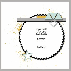
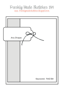
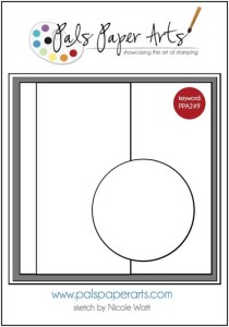
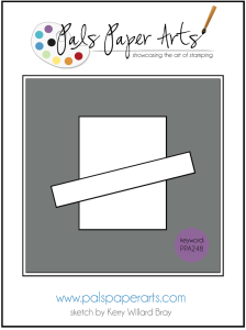
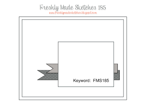
Freshly Made Sketches #185 is a card sketch this week:

FMS Final 185-001
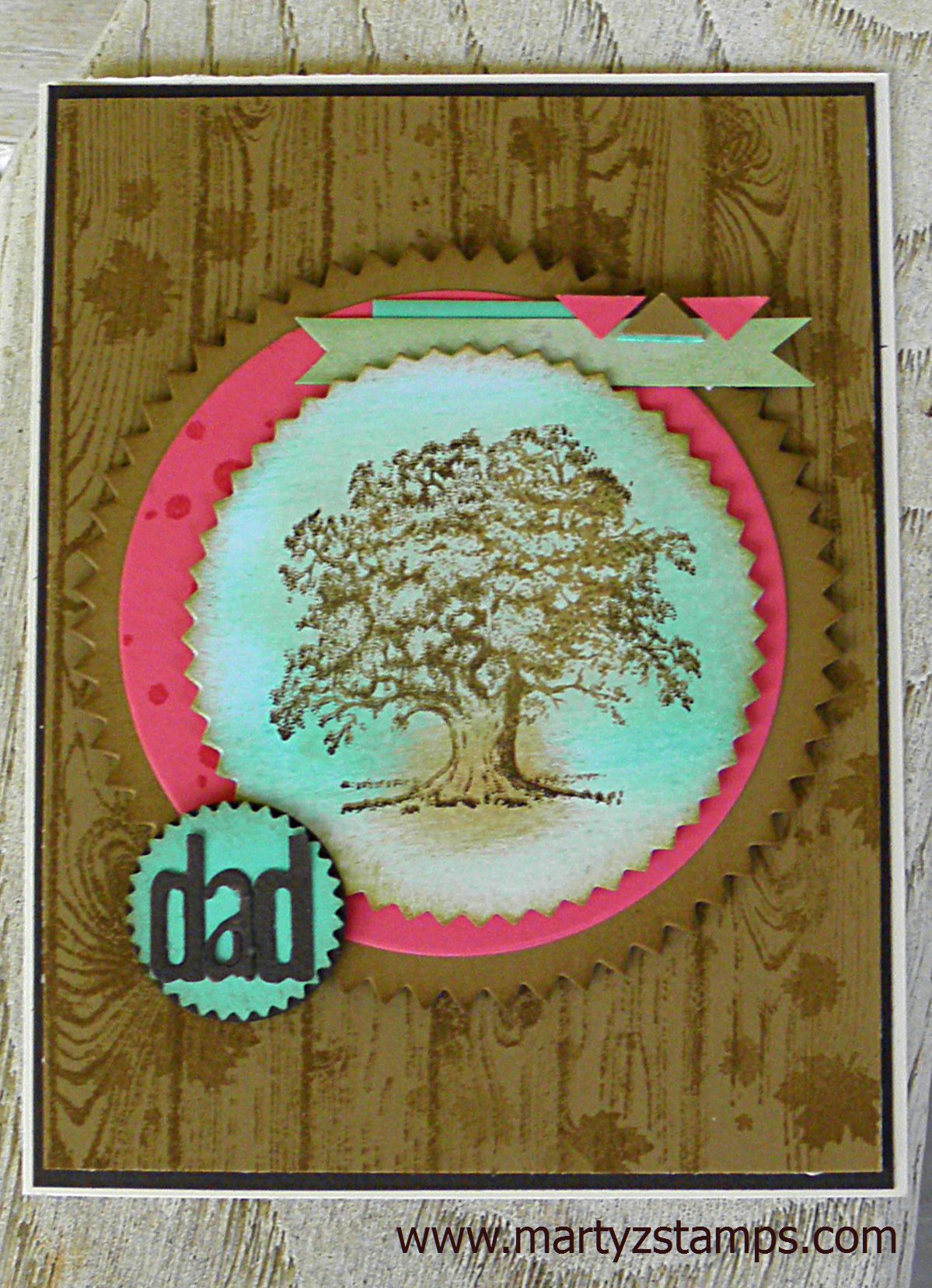
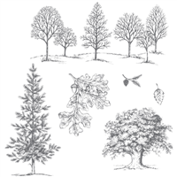
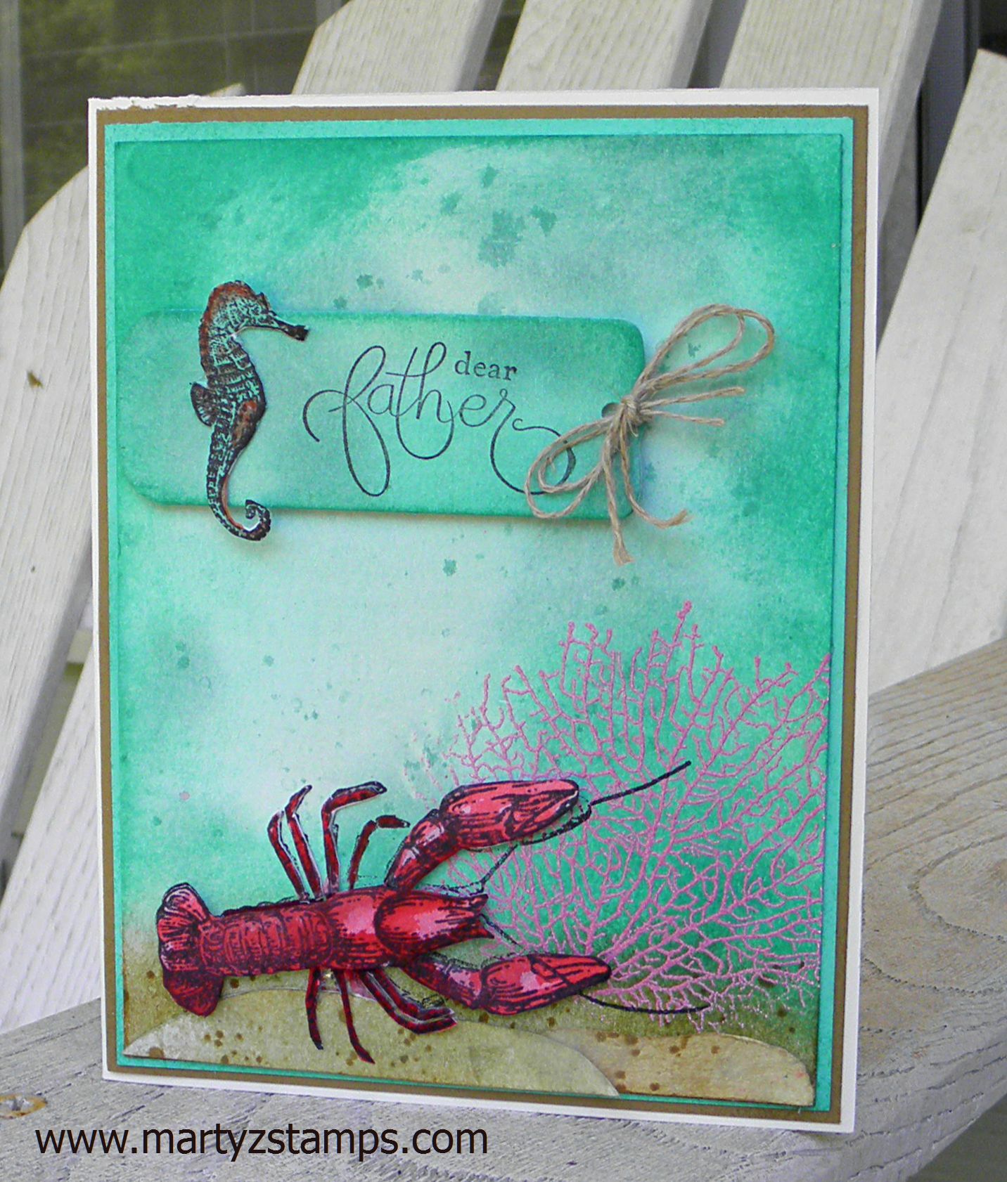
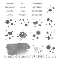
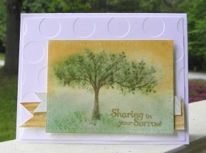
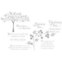
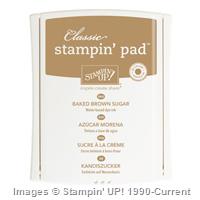
In a previous post, I had mentioned wanting to make a sympathy card, but the card for that challenge turned out to be a Father’s Day card. I have successfully completed a sympathy card for the FMS185 Card Challenge. I really think the SU! Thoughts & Prayers stamp set is fitting for sympathy and get well occasion cards. I chose the tree and the sentiment “Sharing in your Sorrow.” I went with a color combo of Baked Brown Sugar, Hello Honey, and Pistachio Pudding. It took me two efforts to make the watercolor tree portion. This was due to the fact, I usually have “ants in my pants” and can’t wait for the paper to fully dry; therefore, the inks tend to smear easily where I don’t want them to smear.

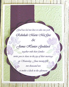
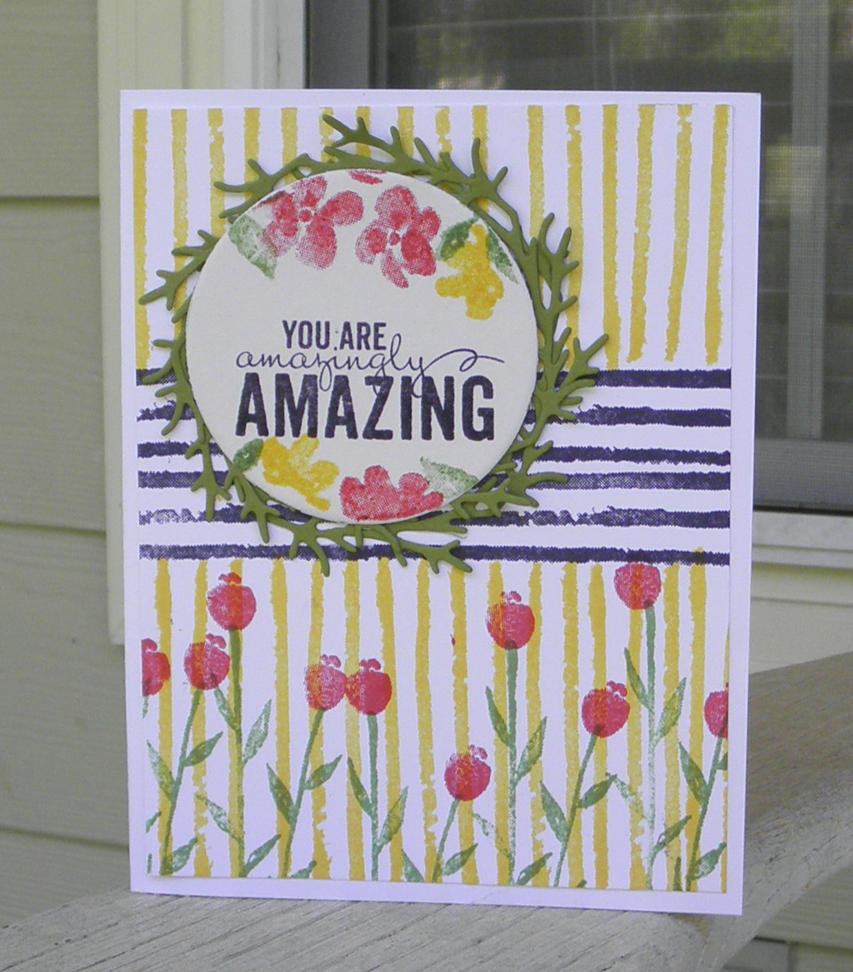
Here is the card I made:
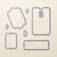
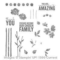
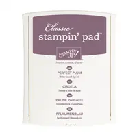
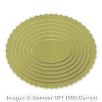
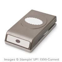
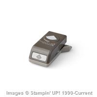
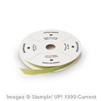
FMS185Supplies:

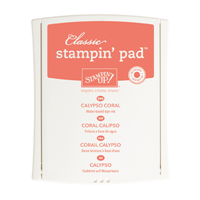
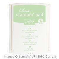
Note: Some reinkers and stampin’ write markers are not showing up on the supply list. I used Baked Brown Sugar, Soft Suede, and Pistachio Pudding Stampin’ Write Markers and the Pistachio Pudding re-inker.

I missed the last SUO Card Challenge; so, I made sure I had my card finished ahead of time. What a great card challenge to celebrate the mothers in our lives. My mother was a very sweet person and a crafting whiz in her own rights. Her area of expertise was sewing. She could sew anything. In fact, she made slipcovers for her sofa and it looked upholstered (in other words, she was REALLY good at sewing).

For this challenge, along with the Mother’s Day theme I chose to use a color challenge from another website. The colors for their challenge are: Calypso Coral, Crushed Curry, and Pool Party. I also wanted to use a stamp set I rarely use but really like. I chose the Peachy Keen SU! stamp set. Once I started on the card, I realized I didn’t have any Crushed Curry cardstock; so, I went digging in my DSP stash and used the Crushed Curry background paper from Color Me Autumn. I guess there’s more than one way to skin a cat. I didn’t have a cute “mom” stamp either. To work around this obstacle, I printed the word MOM onto Calypso Coral cardstock and then cut out the heart using the hearts framelits set. On the Whisper White cardstock I used to stamp “You’re Peach Keen,” I took Crushed Curry ink and lightly stenciled some diagonal lines to give the stamped area some depth. The rest of the card is pretty self-explanatory.

SUO Card Challenge #121:

Supplies:


Wow, Wow, Wow! I LOVE this Color Challenge for FabFriday 63 .

FabFridayColors

In fact, I LOVED this challenge so much, I’m entering two cards for this challenge. I have also combined FabFriday 63 color challenge with two other sketch challenges to sort of “kill two birds with one stone.”  Both of my designs are Father’s Day cards and these colors capture how I remember my father. He was was gregarious, hilarious, vibrant, etc., and these colors fit him to a “T.” Honestly, I don’t know why we stay with neutral colors, for the most part, when we make masculine/male cards. I think this color challenge really makes the two Father’s Day cards I designed really pop!

Here is the first card I designed for this challenge as well as the PCCCS142 sketch challenge (link will take you to my blog post for this card challenge to get the sketch design details).

FabFriday63

Note: It looks like I need two separate posts for each challenge card submitted.

Wow, Wow, Wow! I LOVE this Color Challenge for FabFriday 63 .

FabFridayColors

In fact, I LOVED this challenge so much, I’m entering two cards for this challenge. I have also combined FabFriday 63 color challenge with two other sketch challenges to sort of “kill two birds with one stone.”  Both of my designs are Father’s Day cards and these colors capture how I remember my father. He was was gregarious, hilarious, vibrant, etc., and these colors fit him to a “T.” Honestly, I don’t know why we stay with neutral colors, for the most part, when we make masculine/male cards. I think this color challenge really makes the two Father’s Day cards I designed really pop!

The next Father’s Day card makes me want to go to the beach. The wash of colors makes you want to dive right in to experience this vibrant under the sea creation. I combined the FabFriday63 challenge with FMS#184 sketch challenge (link will take you to my blog post for this card challenge to get the sketch design details).

FMS184

I thoroughly enjoyed making both of these cards. I hope you enjoy them as well.

Supplies: see links for details.


I am so excited to enter this week’s challenge Paper Craft Crew Card Sketch #142 . I combined this challenge with another card challenge using the retiring In Colors and applied these colors to the Paper Craft Crew card sketch challenge.

PCCCS142 sketch

I had sketched my design onto a post it note two nights ago along with another card challenge I wanted to enter. I was ahead of the game! Woo Hoo! I had initially wanted to create a sympathy card. It seems this type of card is in high demand at my make-n-takes (well you know, if you live long enough, this type of card becomes a necessity). But, as the design began to fall into place, I decided to place the sentiment stamp onto the top banner.  I wanted to use “With Sympathy” but the words were too large, and it caused the banner to overpower the tree focal point; plus, even with the Stampa-ma-jig, I couldn’t get those words to go on the banner straight to save my life. After six attempts, I GAVE UP!

So, the wheels began to turn, hmmm……. How ’bout I put a sentiment/word where the star is in the sketch but use a smaller circle. I love the Starburst framelit dies, but they really needed to include “in between” sizes. I would have liked the starburst sentiment with “dad” to have been a hair bit larger. As you can see in the picture below, I decided to focus on a Father’s Day card (it is right around the corner). I think it turned out well. The colors really pop! If you can’t tell by now, bright/bold colors are my favorite!!!!!

Without further ado:

PCCCS142

Supplies:


Supply List

Built for Free Using: My Stampin Blog

This week I have several card challenges I want to enter. One of these is Freshly Made Sketches #184. I had sketched out my design two nights ago on a post it note with the intention of being ahead of the game. In other words, getting my card posted with commentary when I published the post instead of just pictures. But, alas, I was behind due to my own lack of focus. I was thinking the post didn’t have to be entered until 11:50 p.m., Monday, May 4th. It’s a good thing I doubled checked the upload time this morning. Anyway, here is this week’s sketch:

FMS184One of the other challenges I plan to enter had a gorgeous color combination using the retiring In Colors. This really inspired me to create an under the sea card as a Father’s Day card. The Freshly Made Card Sketch #184 was the ideal sketch to make it happen. This is the first time I’ve used my By The Tide SU! stamp set to make a card (it has been sitting on the shelf for several months). I used watercolor paper to create the blend of colors you see below in the challenge card:FMS184

I stamped in Black StazOn the lobster and seahorse onto the watercolor paper and watercolored them with Strawberry Slush reinker for the lobster and a combination of Pistachio Pudding and Coastal Cabana reinkers with touch up on the seahorse belly and back using the Crisp Cantaloupe and Calypso Coral Stampin’ Write markers. The coral was stamped with Versa Mark and embossed with Melon Mambo embossing powder. I layered the sea floor because I had an opportunity to embellish with 3D layers. For those of you new to stamping, this means I made a boo boo and I had to cover it up and NOT restart the card all over again. As you seasoned stampers know, boo boos seem to happen right before you finish the card. LOL

I hope you enjoy this Father’s Day card!

Supplies:

Note: The supply list website I use did not list the Pistachio Pudding reinker; therefore I put the ink pad in it’s place.

Price: $99.95

Price: $29.95

Supply List

Built for Free Using: My Stampin Blog

Another week has passed and it is time for PPA249: A Sketch Challenge:

6a00e54f95df92883401b7c77db942970b-400wi

One of my daughter’s friend will be married this July. She wanted me to make a wedding invitation using mint and plum as the base color combination. I came up with this design (using different names and a different date) for the invitation.

PPA249 Challenge

I can definitely say this color combo does not photograph well. I probably took eight pictures and I finally got the picture above this afternoon. At least you can tell (somewhat) I used Blackberry Bliss and not Basic Black as the accent color. If you’re wondering, I do have a light box along with lights, but the pictures turn out the best when I take them outside. Of course, my friend’s iPhone 6 takes the best pictures, which I do not own one.

Supplies:

I used an MFT die for the scalloped mat.

Paper Craft Crew Card Sketch Card Sketch #140:

PCCCS140 sketch

I liked my original design of a card letting the ladies know in my break-out bible study group that they are
“amazingly AMAZING.”  I decided to make another version of this design for the Paper Craft Crew Card Sketch Challenge #140 . You can view the original design as well as another card challenge which played off the original design here .

I truly recommend SU! Painted Petals as a very versatile stamp set to create a multitude of gorgeous cards. On this card challenge, I enlarged the circle from the original card, added a banner with a rose accent along with two pennant banners attached to the bottom of the sentiment banner. Easy Peasy – another great workshop demo card.


PCCCS140 card


Supplies:

The greenery is a die I purchased from MFT (My Favorite Things stamps). I have no idea what is called. If it is still for sale you will be able to find it under dies.

This week’s PPA248 Sketch Challenge:

PPA248 sketch

I had made cards for a group of ladies in my bible study break-out group for our end of study fellowship last night. I gave each lady in my group one of these cards:

Small Group Card


The design for this card inspired me to translate it into the PPA248 Sketch Card Challenge. This is what I came up with:

PPA248 Card ChallengeThis was such a simple, but Amazing card to create. This would be a great workshop demonstration card featuring just a few of SU! great products. I took a piece of 4″ x 5 1/4″ Whisper White and stamped the striped image from the Painted Petals set in Elegant Eggplant horizontally; then, Daffodil Delight vertically. I added the tulips from Painted Petals to the bottom of the original mat (stems – Wild Wasabi and tulips – Strawberry Slush).  I cut a piece of 4″ x 2 3/4″ Elegant Eggplant to make a mat for the 3 7/8″ x 2 5/8″ Whisper White. I lined up the Whisper White piece with the green stems of the tulips on the main mat and stamped tulip stems onto the Whisper White (don’t forget to use a piece of typewriter paper as a mask – you don’t want to mess up your original mat). I then took the small tulip stems and stamped them across the bottom in Wild Wasabi to create a grass effect). I added some yellow (Daffodil Delight) tulips and some yellow flowers to the bottom Whisper White. I, then, stamped some flowers in Strawberry Slush and Daffodil Delight along with leaves in Wild Wasabi at the top of the card. I stamped the sentiment then cut it down with my SU! Trimmer and cut a “V” shape into each end to make the banner. I adhered the banner with SU! Dimensionals (uh-oh forgot to include them in the supply list), and there you have it!

I LOVE it! I hope you enjoy!

I sat down this afternoon to complete a card for the Paper Craft Crew Card Sketch 139 Challenge. The design team created a lot of awesome samples to spur the imagination. The challenge sketch is below:

PCCCS139sketch

I wanted to have a Mother’s Day card to share with my group of stampers; so, to work I did go. I really, really, really, (did I say really???) love the Birthday Bash DSP and its color combinations. I just can’t get enough of Calypso Coral, Daffodil Delight, Old Olive.. It just reminds me of summer. The sample sketch looks like a 6″ x 6″ card, but I whittled mine down to a 5 1/2″ x 4 1/4″ card. I wanted a fresh, clutter free card; therefore, I only stamped one large flower in Calypso Coral and accented the sentiment with a smaller flower in the same color. I accented the card with butterflies and diamond rhinestones tinted with a Blendabilities marker (Wild Wisteria – darkest color). I made a scallop oval mat for the sentiment by punching two oval scallops, cutting them in half (one vertical; the other horizontal). I then placed them behind the oval with the sentiment to create a border. If there was overlapping that showed, which it did, I trimmed off that portion of the scallop.

I think the card turned out just like I envisioned. I didn’t have a “Hot Mess” in this week’s challenge like I did in a challenge I entered last week. LOL

PCCCS139


Supplies:

Note – I listed Well Scripted as a digital download since it is retired (I used the clear mount set).

Price: $99.95

Supply List

Built for Free Using: My Stampin Blog

PAGE TOP
[dealsbar preview] Amazing Deals: !!toolbar-deal-title!! - !!toolbar-deal-merchant!!