Tag : Lovely As A Tree

2 posts

Wow, Wow, Wow! I LOVE this Color Challenge for FabFriday 63 .

FabFridayColors

In fact, I LOVED this challenge so much, I’m entering two cards for this challenge. I have also combined FabFriday 63 color challenge with two other sketch challenges to sort of “kill two birds with one stone.”  Both of my designs are Father’s Day cards and these colors capture how I remember my father. He was was gregarious, hilarious, vibrant, etc., and these colors fit him to a “T.” Honestly, I don’t know why we stay with neutral colors, for the most part, when we make masculine/male cards. I think this color challenge really makes the two Father’s Day cards I designed really pop!

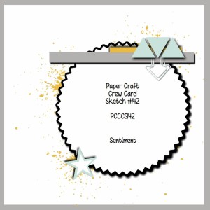
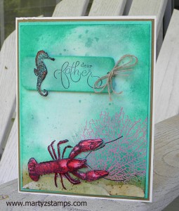
The next Father’s Day card makes me want to go to the beach. The wash of colors makes you want to dive right in to experience this vibrant under the sea creation. I combined the FabFriday63 challenge with FMS#184 sketch challenge (link will take you to my blog post for this card challenge to get the sketch design details).

FMS184

I thoroughly enjoyed making both of these cards. I hope you enjoy them as well.

Supplies: see links for details.


I am so excited to enter this week’s challenge Paper Craft Crew Card Sketch #142 . I combined this challenge with another card challenge using the retiring In Colors and applied these colors to the Paper Craft Crew card sketch challenge.

PCCCS142 sketch

I had sketched my design onto a post it note two nights ago along with another card challenge I wanted to enter. I was ahead of the game! Woo Hoo! I had initially wanted to create a sympathy card. It seems this type of card is in high demand at my make-n-takes (well you know, if you live long enough, this type of card becomes a necessity). But, as the design began to fall into place, I decided to place the sentiment stamp onto the top banner.  I wanted to use “With Sympathy” but the words were too large, and it caused the banner to overpower the tree focal point; plus, even with the Stampa-ma-jig, I couldn’t get those words to go on the banner straight to save my life. After six attempts, I GAVE UP!

So, the wheels began to turn, hmmm……. How ’bout I put a sentiment/word where the star is in the sketch but use a smaller circle. I love the Starburst framelit dies, but they really needed to include “in between” sizes. I would have liked the starburst sentiment with “dad” to have been a hair bit larger. As you can see in the picture below, I decided to focus on a Father’s Day card (it is right around the corner). I think it turned out well. The colors really pop! If you can’t tell by now, bright/bold colors are my favorite!!!!!

Without further ado:

PCCCS142

Supplies:


Supply List

Built for Free Using: My Stampin Blog

PAGE TOP
[dealsbar preview] Amazing Deals: !!toolbar-deal-title!! - !!toolbar-deal-merchant!!