I missed the last SUO Card Challenge; so, I made sure I had my card finished ahead of time. What a great card challenge to celebrate the mothers in our lives. My mother was a very sweet person and a crafting whiz in her own rights. Her area of expertise was sewing. She could sew anything. In fact, she made slipcovers for her sofa and it looked upholstered (in other words, she was REALLY good at sewing).

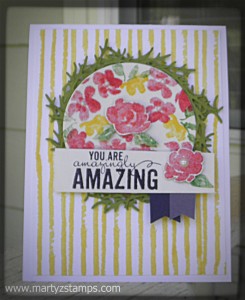
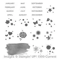
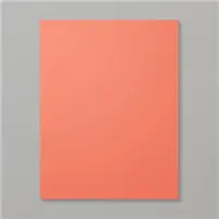
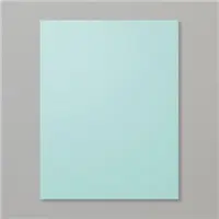
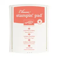
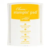
For this challenge, along with the Mother’s Day theme I chose to use a color challenge from another website. The colors for their challenge are: Calypso Coral, Crushed Curry, and Pool Party. I also wanted to use a stamp set I rarely use but really like. I chose the Peachy Keen SU! stamp set. Once I started on the card, I realized I didn’t have any Crushed Curry cardstock; so, I went digging in my DSP stash and used the Crushed Curry background paper from Color Me Autumn. I guess there’s more than one way to skin a cat. I didn’t have a cute “mom” stamp either. To work around this obstacle, I printed the word MOM onto Calypso Coral cardstock and then cut out the heart using the hearts framelits set. On the Whisper White cardstock I used to stamp “You’re Peach Keen,” I took Crushed Curry ink and lightly stenciled some diagonal lines to give the stamped area some depth. The rest of the card is pretty self-explanatory.

SUO Card Challenge #121:

Supplies:


The new 2015-2016 Stampin’ Up! Catalog will be in our hands within a week or two!!!!! I have just placed a pre-order from the demonstrator sneak peek selection. I can’t wait until the product arrives on my front porch. I also placed an order for the new 2015-2016 SU! Catalogs. I know those of you who signed up for a catalog will be excited to have it in your hands withing the next two weeks.

I just wanted to mention a few benefits of being a SU! demonstrator are:

  • Getting to see the new 2015-2016 SU! Catalog online weeks ahead of the official release date
  • Pre-ordering select new products a month before customer’s can order
  • Pre-ordering hostess exclusive stamp sets
  • Making great cards, scrapbook pages, and giftables before customer’s
  • Access to awesome demonstrator only SU! videos about products and video tutorials

If you are interested in having access to the benefits mentioned above, please click on the tab near the top of the page that says Join SU! Now for more details.


Wow, Wow, Wow! I LOVE this Color Challenge for FabFriday 63 .

FabFridayColors

In fact, I LOVED this challenge so much, I’m entering two cards for this challenge. I have also combined FabFriday 63 color challenge with two other sketch challenges to sort of “kill two birds with one stone.”  Both of my designs are Father’s Day cards and these colors capture how I remember my father. He was was gregarious, hilarious, vibrant, etc., and these colors fit him to a “T.” Honestly, I don’t know why we stay with neutral colors, for the most part, when we make masculine/male cards. I think this color challenge really makes the two Father’s Day cards I designed really pop!

Here is the first card I designed for this challenge as well as the PCCCS142 sketch challenge (link will take you to my blog post for this card challenge to get the sketch design details).

FabFriday63

Note: It looks like I need two separate posts for each challenge card submitted.

Wow, Wow, Wow! I LOVE this Color Challenge for FabFriday 63 .

FabFridayColors

In fact, I LOVED this challenge so much, I’m entering two cards for this challenge. I have also combined FabFriday 63 color challenge with two other sketch challenges to sort of “kill two birds with one stone.”  Both of my designs are Father’s Day cards and these colors capture how I remember my father. He was was gregarious, hilarious, vibrant, etc., and these colors fit him to a “T.” Honestly, I don’t know why we stay with neutral colors, for the most part, when we make masculine/male cards. I think this color challenge really makes the two Father’s Day cards I designed really pop!

The next Father’s Day card makes me want to go to the beach. The wash of colors makes you want to dive right in to experience this vibrant under the sea creation. I combined the FabFriday63 challenge with FMS#184 sketch challenge (link will take you to my blog post for this card challenge to get the sketch design details).

FMS184

I thoroughly enjoyed making both of these cards. I hope you enjoy them as well.

Supplies: see links for details.


I am so excited to enter this week’s challenge Paper Craft Crew Card Sketch #142 . I combined this challenge with another card challenge using the retiring In Colors and applied these colors to the Paper Craft Crew card sketch challenge.

PCCCS142 sketch

I had sketched my design onto a post it note two nights ago along with another card challenge I wanted to enter. I was ahead of the game! Woo Hoo! I had initially wanted to create a sympathy card. It seems this type of card is in high demand at my make-n-takes (well you know, if you live long enough, this type of card becomes a necessity). But, as the design began to fall into place, I decided to place the sentiment stamp onto the top banner.  I wanted to use “With Sympathy” but the words were too large, and it caused the banner to overpower the tree focal point; plus, even with the Stampa-ma-jig, I couldn’t get those words to go on the banner straight to save my life. After six attempts, I GAVE UP!

So, the wheels began to turn, hmmm……. How ’bout I put a sentiment/word where the star is in the sketch but use a smaller circle. I love the Starburst framelit dies, but they really needed to include “in between” sizes. I would have liked the starburst sentiment with “dad” to have been a hair bit larger. As you can see in the picture below, I decided to focus on a Father’s Day card (it is right around the corner). I think it turned out well. The colors really pop! If you can’t tell by now, bright/bold colors are my favorite!!!!!

Without further ado:

PCCCS142

Supplies:


Supply List

Built for Free Using: My Stampin Blog

This week I have several card challenges I want to enter. One of these is Freshly Made Sketches #184. I had sketched out my design two nights ago on a post it note with the intention of being ahead of the game. In other words, getting my card posted with commentary when I published the post instead of just pictures. But, alas, I was behind due to my own lack of focus. I was thinking the post didn’t have to be entered until 11:50 p.m., Monday, May 4th. It’s a good thing I doubled checked the upload time this morning. Anyway, here is this week’s sketch:

FMS184One of the other challenges I plan to enter had a gorgeous color combination using the retiring In Colors. This really inspired me to create an under the sea card as a Father’s Day card. The Freshly Made Card Sketch #184 was the ideal sketch to make it happen. This is the first time I’ve used my By The Tide SU! stamp set to make a card (it has been sitting on the shelf for several months). I used watercolor paper to create the blend of colors you see below in the challenge card:FMS184

I stamped in Black StazOn the lobster and seahorse onto the watercolor paper and watercolored them with Strawberry Slush reinker for the lobster and a combination of Pistachio Pudding and Coastal Cabana reinkers with touch up on the seahorse belly and back using the Crisp Cantaloupe and Calypso Coral Stampin’ Write markers. The coral was stamped with Versa Mark and embossed with Melon Mambo embossing powder. I layered the sea floor because I had an opportunity to embellish with 3D layers. For those of you new to stamping, this means I made a boo boo and I had to cover it up and NOT restart the card all over again. As you seasoned stampers know, boo boos seem to happen right before you finish the card. LOL

I hope you enjoy this Father’s Day card!

Supplies:

Note: The supply list website I use did not list the Pistachio Pudding reinker; therefore I put the ink pad in it’s place.

Price: $99.95

Price: $29.95

Supply List

Built for Free Using: My Stampin Blog

My group of stampers has had a yearly event called “Christmas in the Woods” Stamp Camp. The last few years we have held the stamp camp in November, but when we first started out, the stamp camps were held either in September or October. We spend Friday night, all day Saturday and into the night creating Christmas cards, 3D projects, along with games and prizes for everyone, and Sunday we head home very exhausted.

Each stamper receives a Christmas card from me. This card was given to the attendees at the Third Annual Christmas in the Woods stamp camp. I still have this stamp set. And . . . . here it is:

3rd Annual stamp campI love this stamp set. This card was colored with stampin’ write markers with some sponging. Hope you enjoy this throwback!

I am thrilled to have made it in the featured Artisan section for Paper Craft Crew Card Sketch #140:

Paper Pal Crew Featured ArtistI really have been using the Painted Petals stamp set A LOT! It is just so versatile. I am sad, though, because I misplaced one of the leaves while making a challenge card yesterday. Those darn ‘ol photopolymer stamp sets just blend in with their surroundings. I’m still hoping it will turn up at some point in time.

Anyway, here is the featured card:


PCCCS140 cardSomeone just bought this card from me at church to give a mother or grandmother a mother’s day card. I hope this card inspires you!


Another week has passed and it is time for PPA249: A Sketch Challenge:

6a00e54f95df92883401b7c77db942970b-400wi

One of my daughter’s friend will be married this July. She wanted me to make a wedding invitation using mint and plum as the base color combination. I came up with this design (using different names and a different date) for the invitation.

PPA249 Challenge

I can definitely say this color combo does not photograph well. I probably took eight pictures and I finally got the picture above this afternoon. At least you can tell (somewhat) I used Blackberry Bliss and not Basic Black as the accent color. If you’re wondering, I do have a light box along with lights, but the pictures turn out the best when I take them outside. Of course, my friend’s iPhone 6 takes the best pictures, which I do not own one.

Supplies:

I used an MFT die for the scalloped mat.

Just wanted to let everyone know I was one of the top three featured artisans at www.suochallenges.com . I am very excited about being featured for this particular card challenge. Cheyenne, my friend and co-designer (on this card), deserves credit as well. Here is the card that was featured in the Top 3:

Perfect Blend2

Here is the link back to the original post http://martyzstamps.com/2015/03/24/suo-challenge-119-fun-folds/

PAGE TOP
[dealsbar preview] Amazing Deals: !!toolbar-deal-title!! - !!toolbar-deal-merchant!!