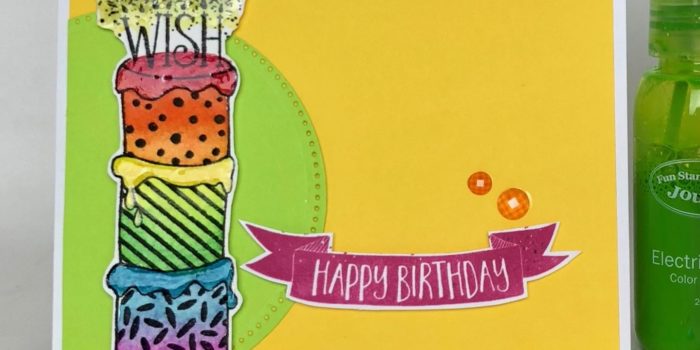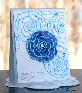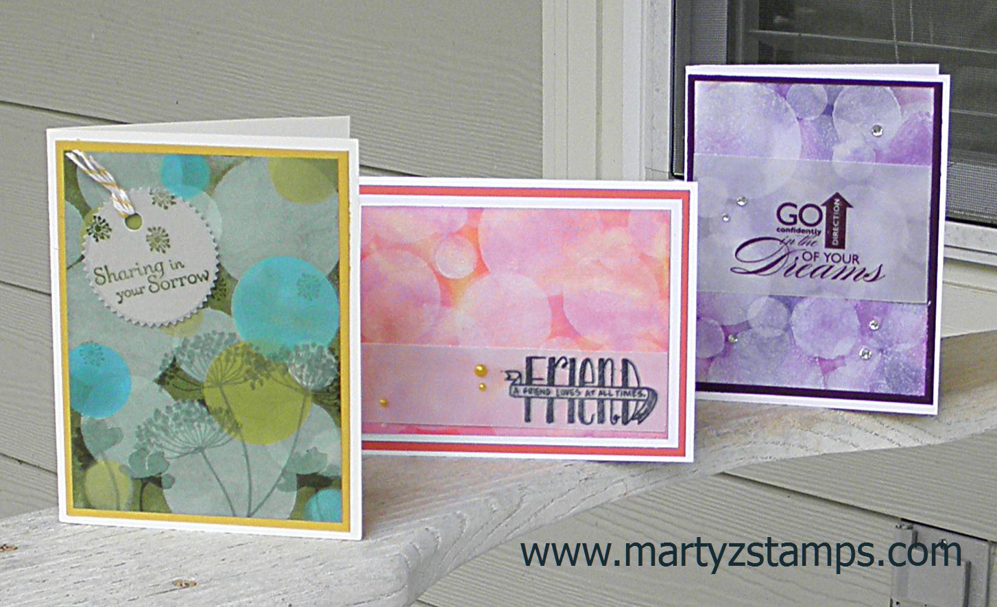
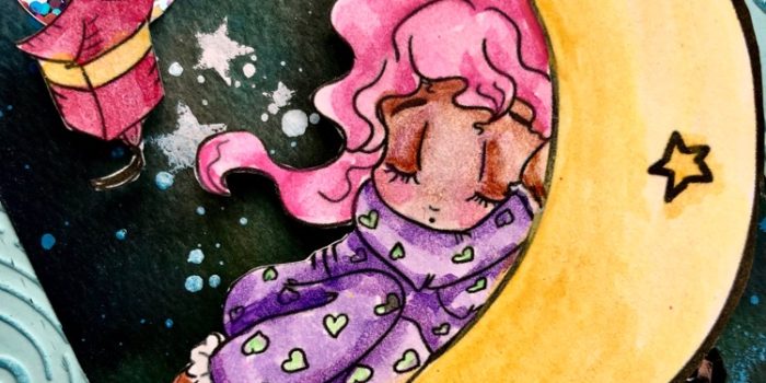
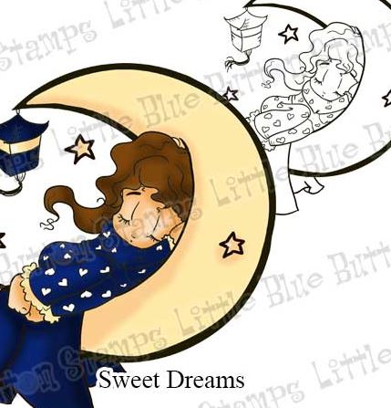
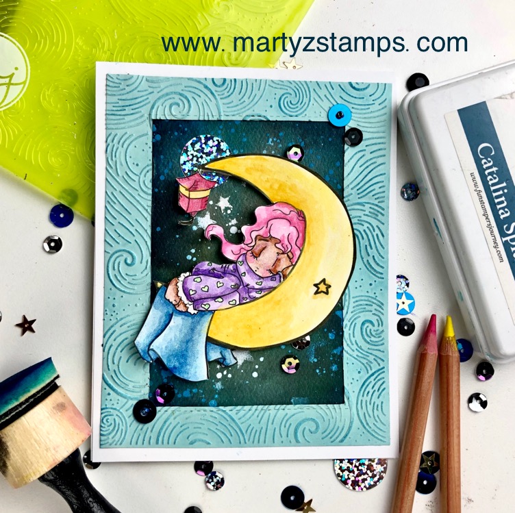
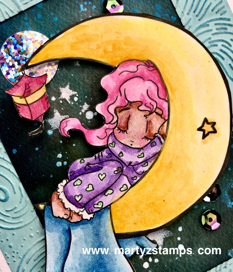
Hello! I’m sharing a card today made with the so cute Sweet Dreams digital image from Little Blue Button Stamps.
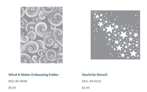
To create a soft dreamy effect, I pulled out my FSJ Color Splash pencils and watercolored the Sweet Dreams image. The background was created using FSJ silks onto watercolor paper and the stars by applying acrylic paint with a sponge using the FSJ Starbrite Stencil. The frame was embossed with the FSJ Wind & Water Embossing Folder and Catalina ink applied to the embossed areas. The final touch were the Splash Zone Sequins adding a little glitz and glam to the night sky.
I hope you sleep well with sweet dreams!
Supplies:
Little Blue Button Stamps

Spellbinders + FSJ:
- Whip Cream 8.5 x 11 Cardstock

- Price: $6.95
- Pool Play 8.5x11 Cardstock

- Price: $6.95
- Color Splash Watercolor Sheets

- Price: $9.95
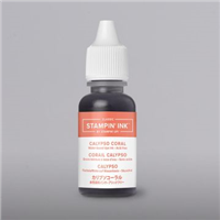
- Catalina Splash True Color Fusion Ink Pad

- Price: $7.95
- Journey Color Splash Watercolor Pencils

- Price: $59.95
- Journey Foam Squares - small

- Price: $2.95
- Journey Foam Squares - medium

- Price: $2.95
- Dauber Dowel Large (3 cm)

- Price: $7.95
- Whip Cream Acrylic Paint

- Price: $5.95
- Details Pro Shears

- Price: $13.95
- Journey Craft Glue

- Price: $4.95
- Fusion Ink Sponges

- Price: $4.95
- Cool Pool Silk

- Price: $5.95
- Electric Lime Silk

- Price: $5.95
- Turbo Teal Silk

- Price: $5.95
- Black Licorice Silk

- Price: $5.95
- Beach Ball Silk

- Price: $5.95
- Media Mister - 4 pack misters

- Price: $5.95