It has been a while since I have posted anything. I have been quite busy!!!! One of my daughter’s friends from Master’s Commission ATL at Victory World Church is getting married in July. She had asked Rebekah (my daughter) if I could give her a price for making wedding invitations. I said, o.k. But, I said I would do a digital one on MDS (My Digital Studio) for her because making invitations takes a lot of time. So, I worked on a digital version for her and I was never happy with the results; plus, Rebekah and her family moved in with us due to an apartment issue and it was just CRAZY around here! I ultimately suggested to the bride-to-be an online digital company that specializes in wedding invitations, because I just didn’t have enough time to do the project justice. Well, that company wanted to charge a ridiculous fee for postcard type invitations. So, I said let’s do it; we’ll just make them.
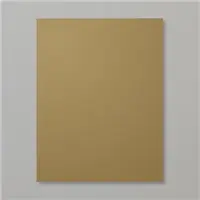
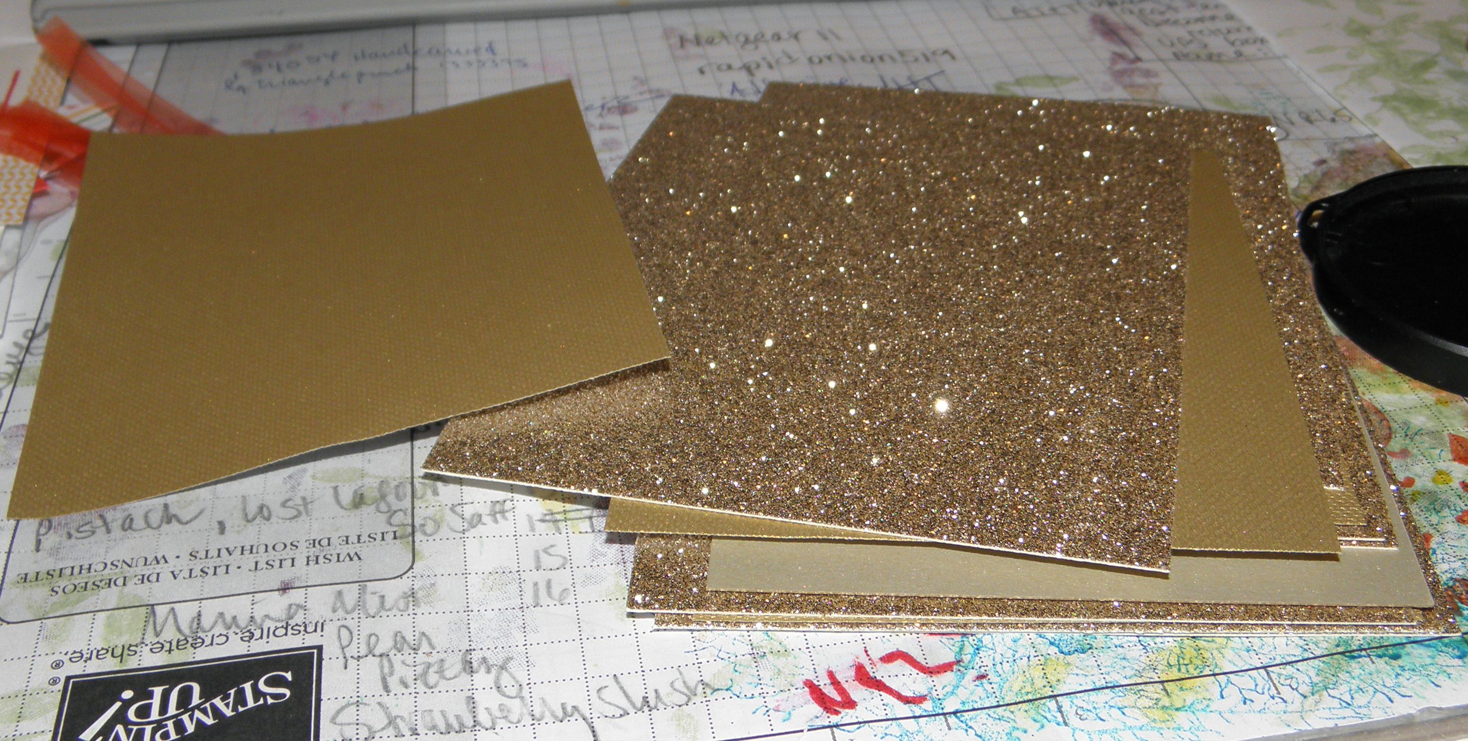
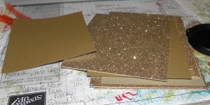
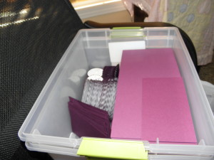
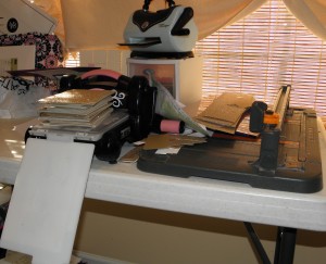
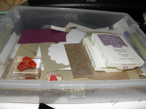
Thus, it started. I ordered the paper for 250 invitations as well as going to Hobby Lobby for specialty paper (SU! is no longer offering the gold matte paper and it was already sold out from the retired list). Once the paper was ordered, I began with printing out the main wedding portion of the invitation along with the reception location since I had Whisper White cardstock on hand. I was able to make a few of the envelope/card portions as well. Needless to say, there were a few revisions along the way.
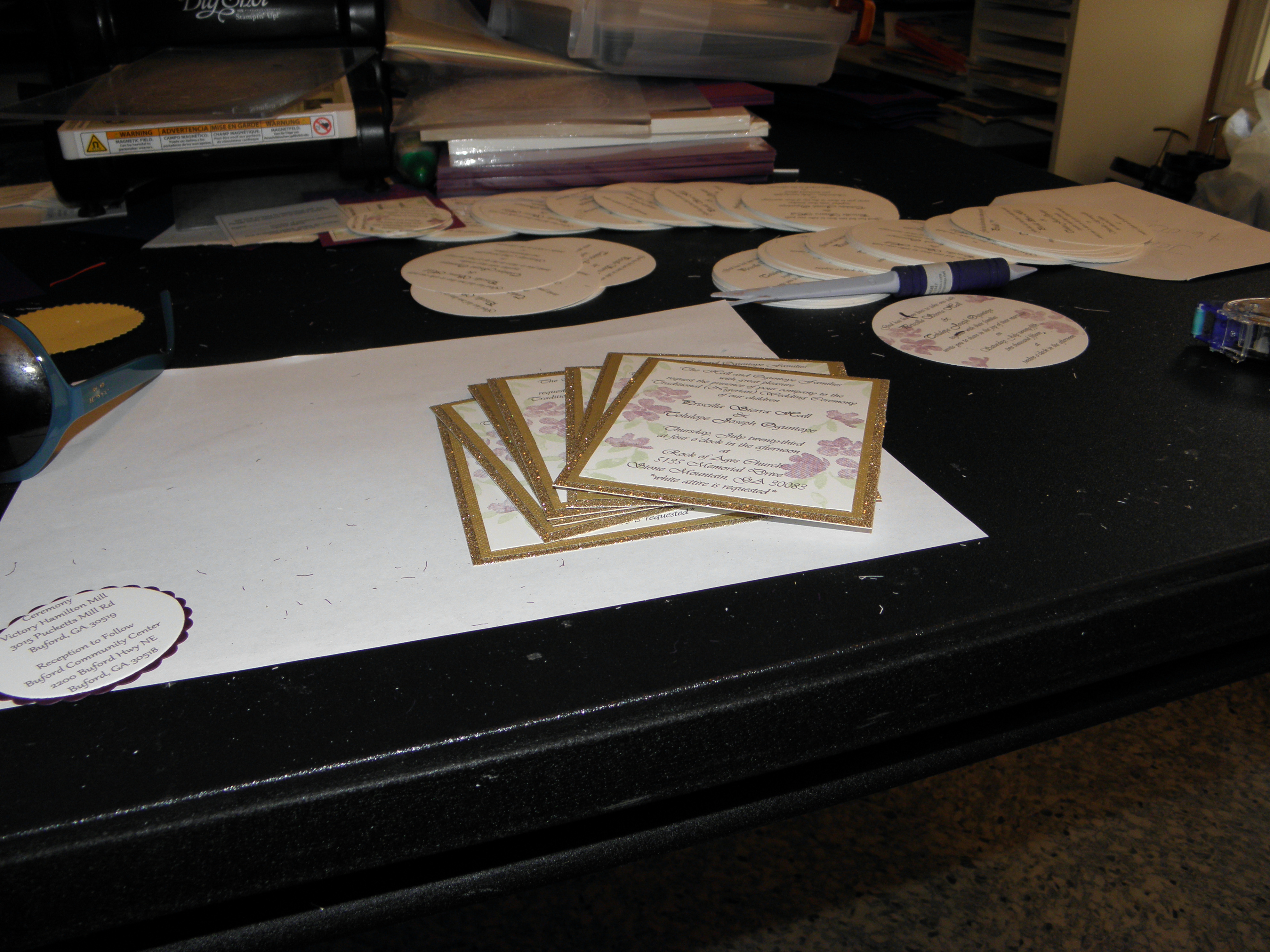
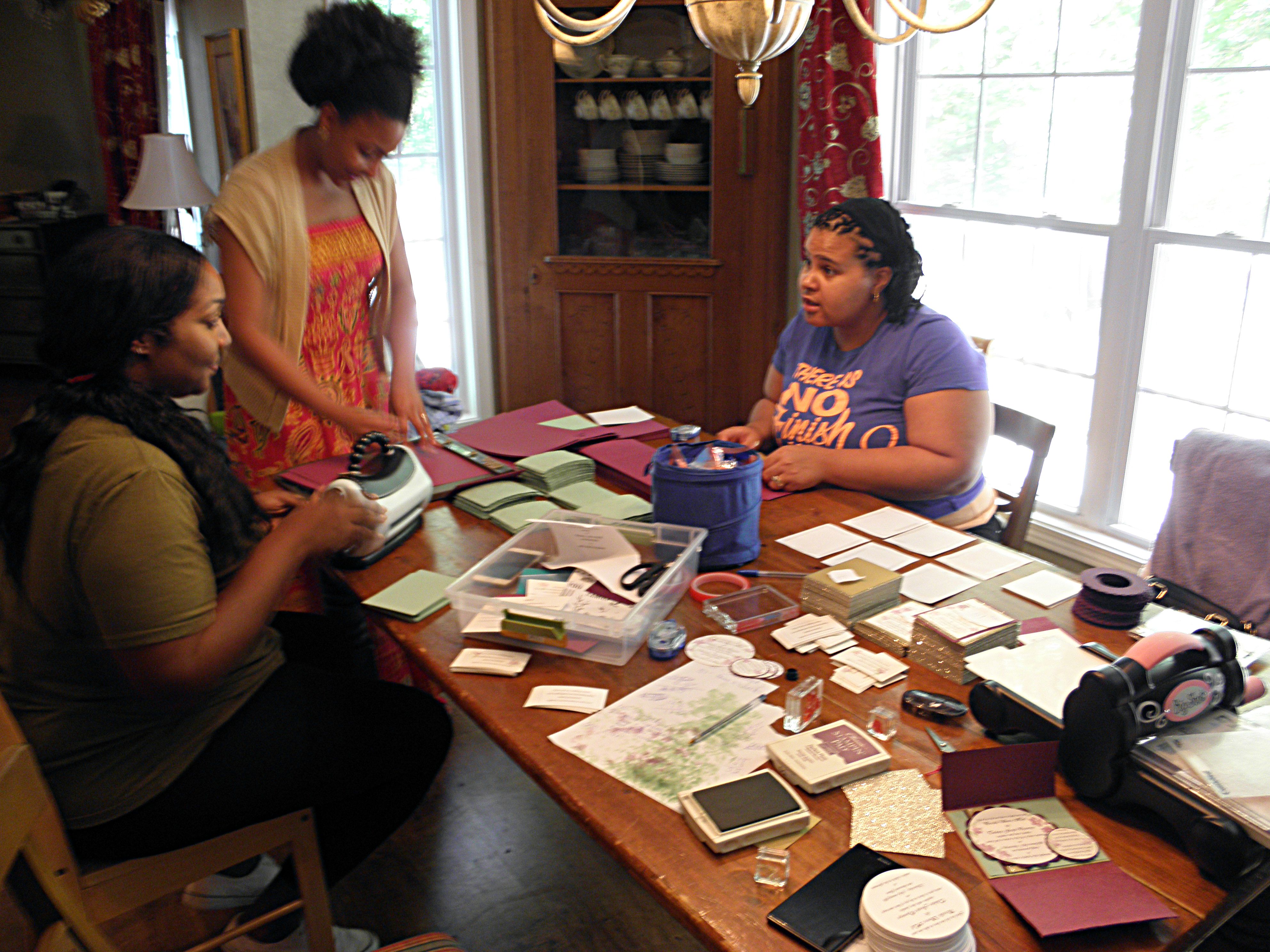
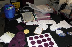
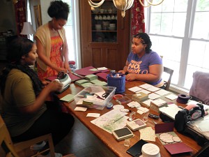
The paper came in on a Wednesday and the bride-to-be came over to help work on the invites all day Tuesday prior to the paper arriving. Wednesday the paper came in and I printed, printed, printed, and cut, cut, cut, and stamped, stamped, stamped. She came over again on Thursday, and we worked ALL day on the invitations. On Friday, we had help from one of the bridesmaids and the bride’s sister. We worked ALL day. Saturday and Sunday we relaxed and worked ALL day again on Monday. The bride came back over on Tuesday and we worked all afternoon pulling it all together.
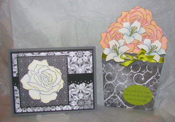
Here are some pictures of the Friday we worked on them:

I almost forgot, the bride-to-be and I still worked Wednesday afternoon (if I remember correctly – it’s all a blur). We were all, definitely, exhausted. In fact, I slept pretty much all day and evening Thursday after my hair cut appointment. I was still tired Friday morning and had a lot of errands to run before we leave on vacation.
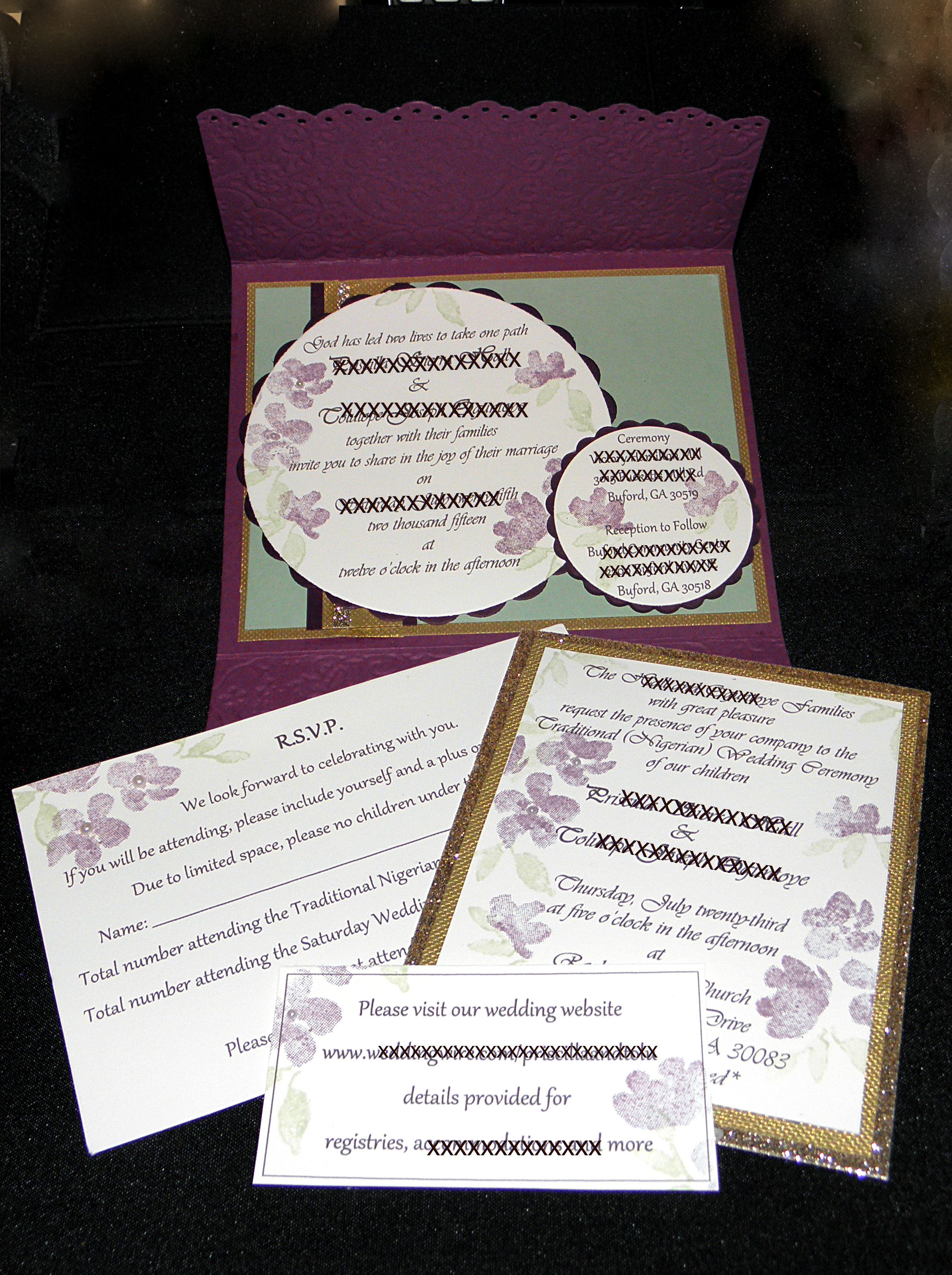
I couldn’t have been happier with the results and here is the Wedding Invitation with the Traditional Nigerian Wedding insert which family and bridal party received.
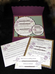
Note: I blocked out the names and locations of the bride, groom, and family for their privacy.
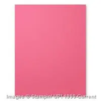
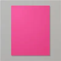
The base of the invitation is the envelope. I cut a piece of Rich Razzleberry to 11″ x 5 1/4″. I took the left over piece of cardstock and cut it to 3.25″ x 5 3/4″. I then took the larger piece and scored it at 2 1/2″ and 7″, and the smaller piece I scored at 1/4″ on three sides to create the pocket at the bottom of the envelope to hold the r.s.v.p. card, the website information card, and the Traditional Nigerian Wedding ceremony information.
I was able to cut three each of the circles and scallops at a time, but each circle was stamped individually (of course); that’s 250 x 2 sets of circles (500). The same is true for the r.s.v.p. card and the website information card. There were only 175 Traditional Nigerian Wedding invitations. The picture above is for my portfolio and I added some bling to it as well as the bride’s invitation with some pearls. Of course, the picture doesn’t do the invitation set justice. Once the wedding is over, I’ll add some pictures without the blocked information with individual pictures as well of each insert.

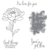
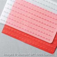
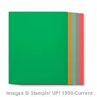
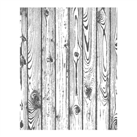
 Supplies:
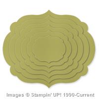
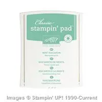